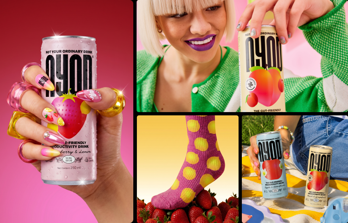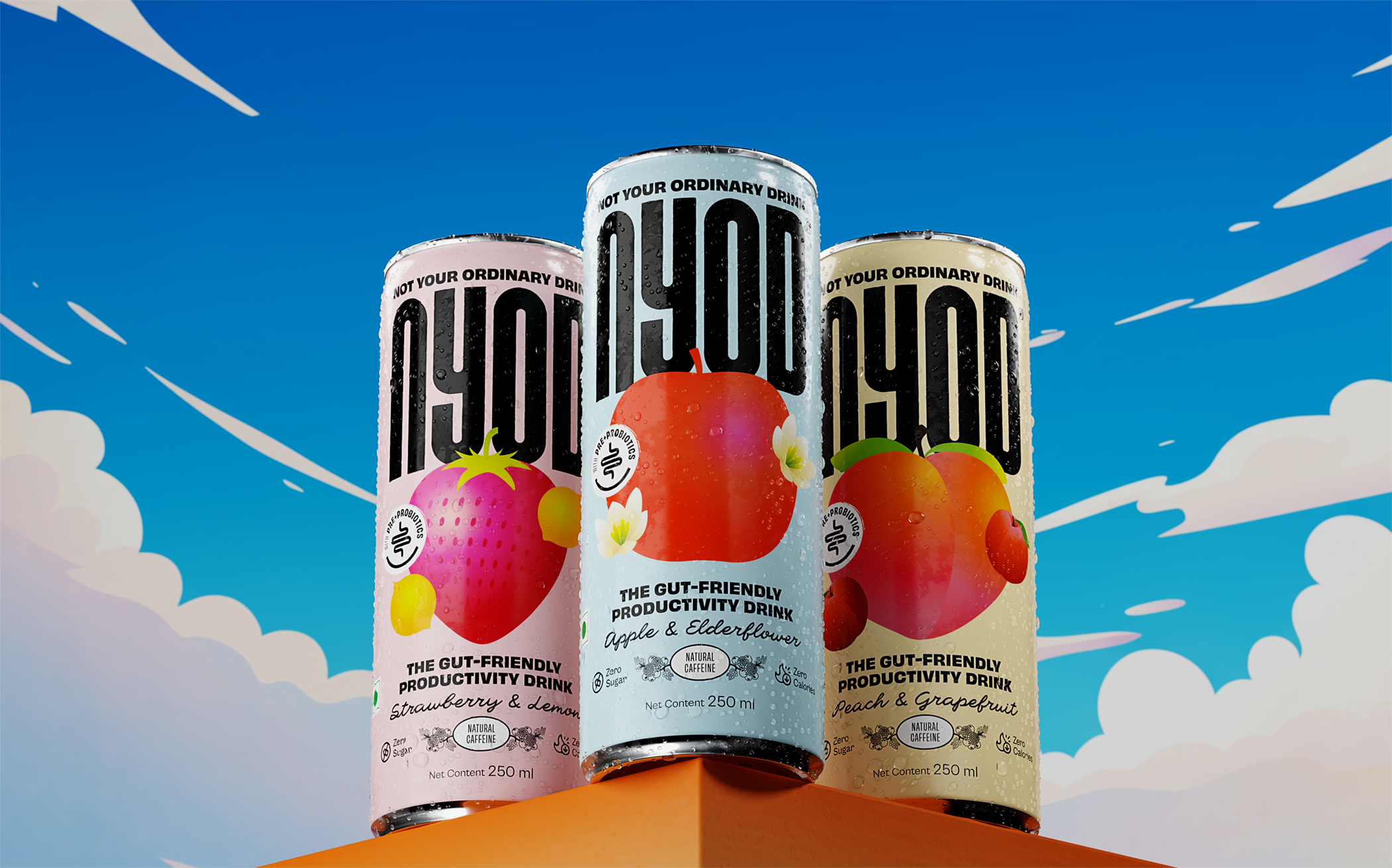
The ordinary route
wasn't nearly as interesting.
NYOD – Not Your Ordinary Drink, came to us as the first-of-its-kind synbiotic drink in the country, combining energy with pre and probiotics, entering a category growing by the week. But while the product was different, our challenge was making the brand feel different, too. So, we rolled up our sleeves and got to work on the research, positioning, messaging, identity, packaging, and website that would bring NYOD to life.
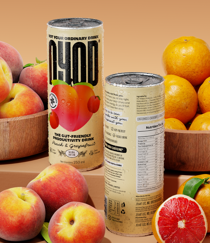
Our process began with a deep dive into the beverage space, both in India and beyond. And the more we looked, the more we realised everyone was chasing performance, speaking in claims, benefits, and buzzwords. The products varied, but the communication sounded the same. There, we saw an opportunity to build a brand that felt a little more human. A brand that felt more like a recommendation from a friend in a grocery run than a pitch from a marketer.
![Free_Billboard_Mockup_1[corrected cropped]](https://agenc.xyz/wp-content/uploads/2026/06/Free_Billboard_Mockup_1corrected-cropped.png "Free_Billboard_Mockup_1[corrected cropped]")

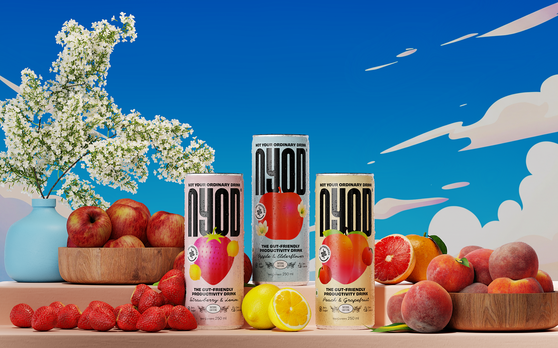
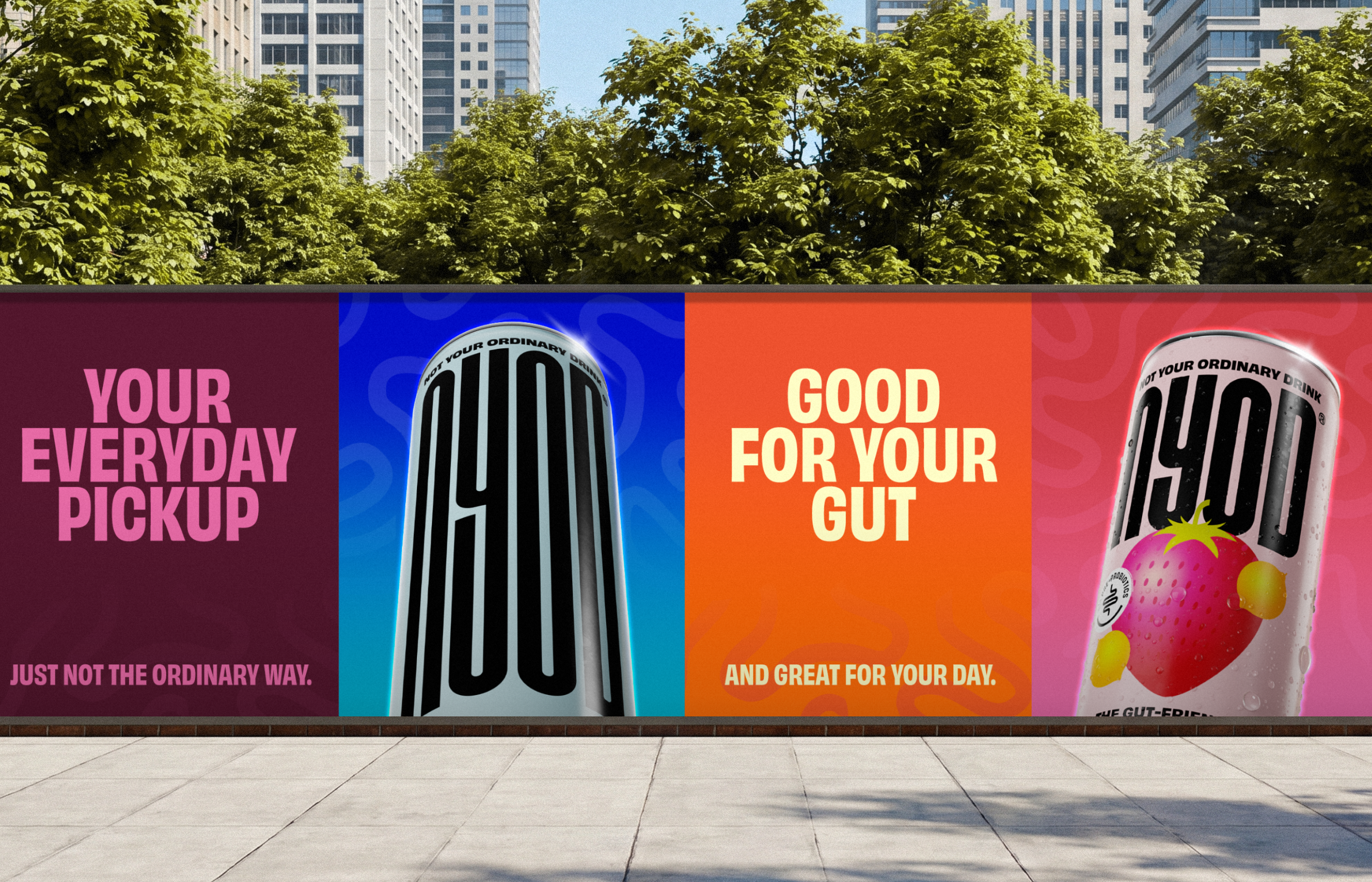
That thinking carried into every part of the identity. Inspired by the gut itself, the logo takes shape through interconnected forms, creating a mark that is distinctive and versatile, without becoming overly literal. Around it, we built a visual language that pairs bright illustrations with conversational messaging, bringing a sense of ease to the category.
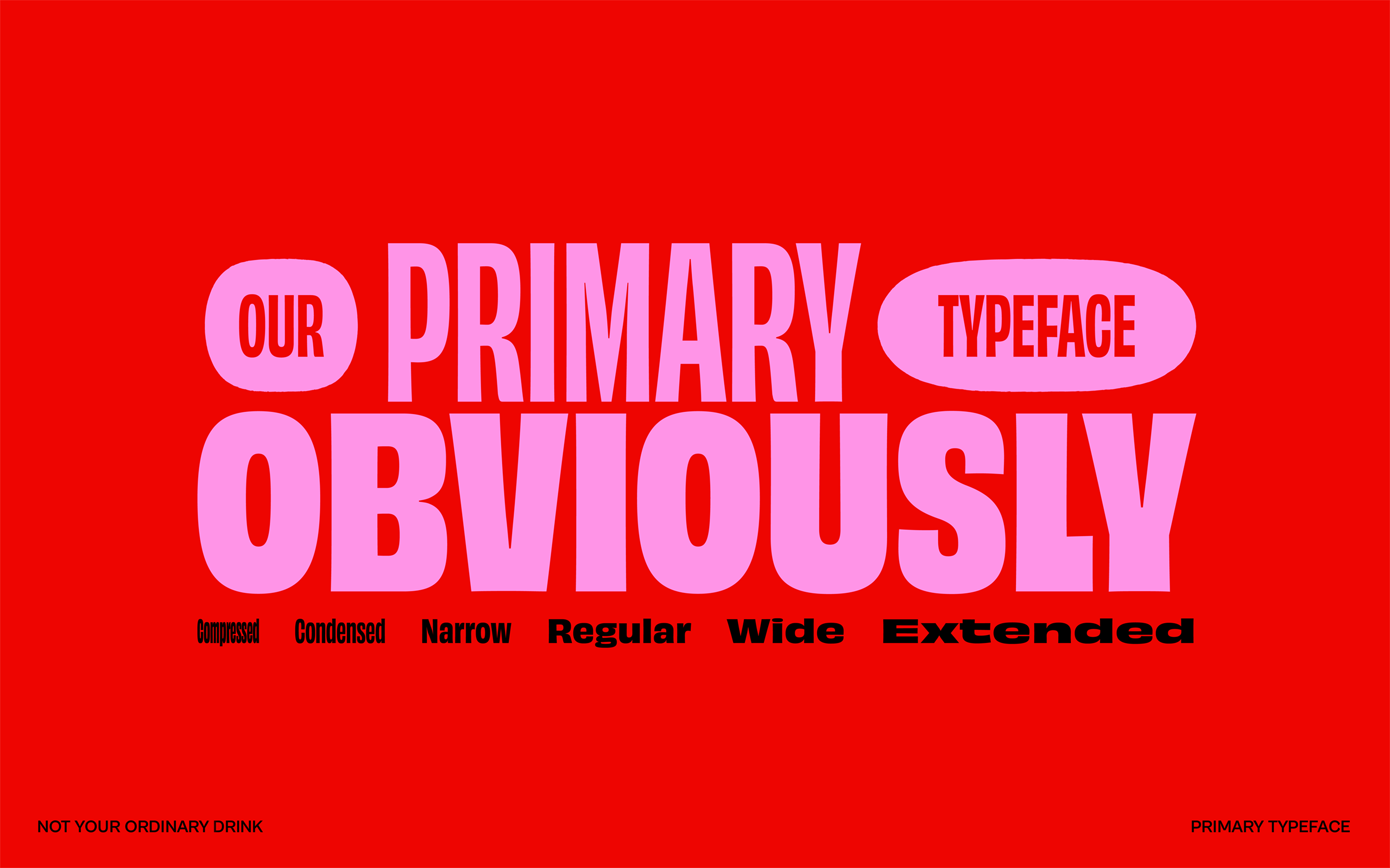
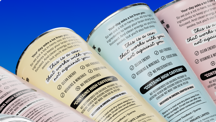
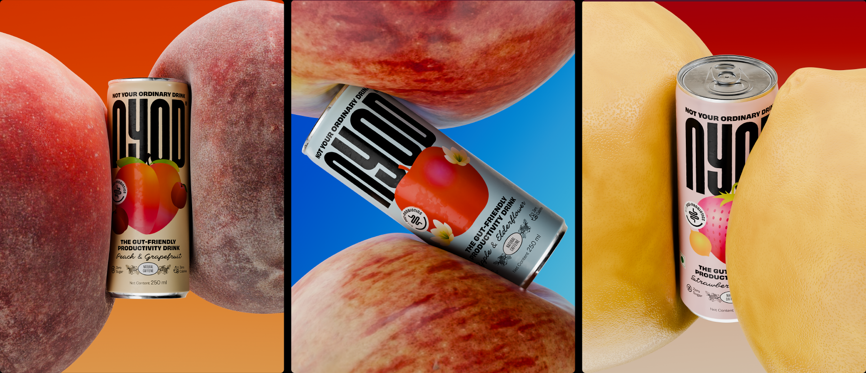
The palette takes cues from the flavours, allowing each variant its own character while still feeling part of the same family. Typography became another way to hold this balance. The bold sans brings clarity and confidence, while a handwritten script softens the edges, introducing a sense of spontaneity and warmth. Together, they create a brand that feels just as comfortable to make you productive as it does to ask how your day is going.
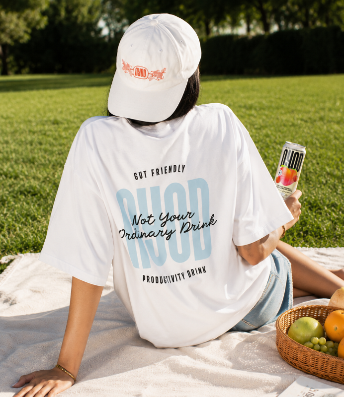
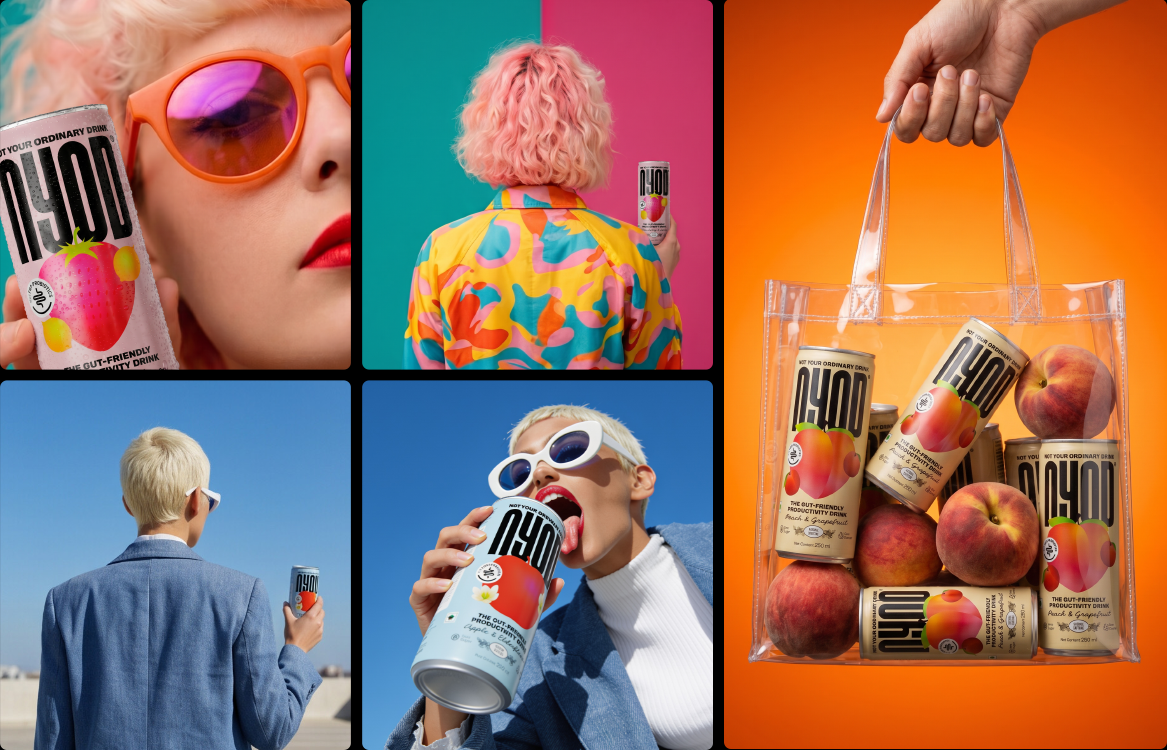
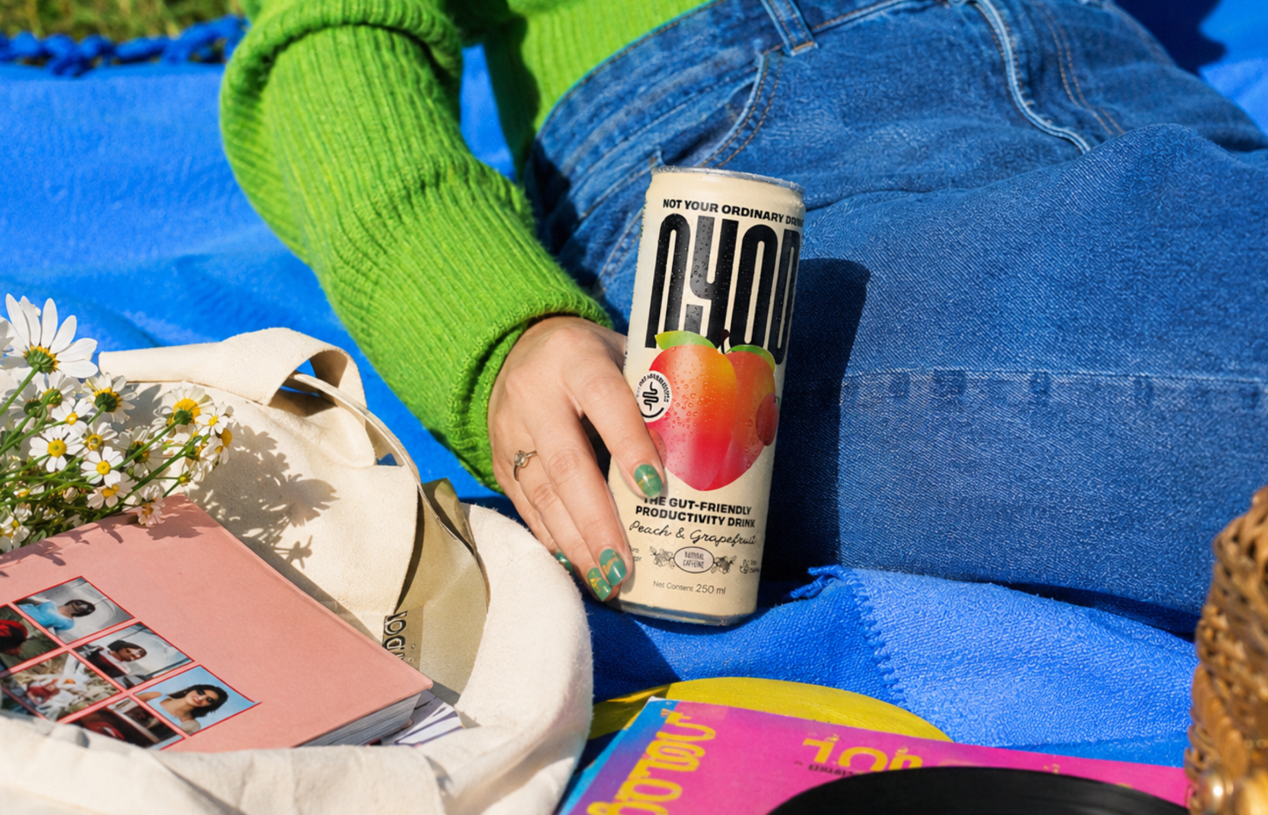
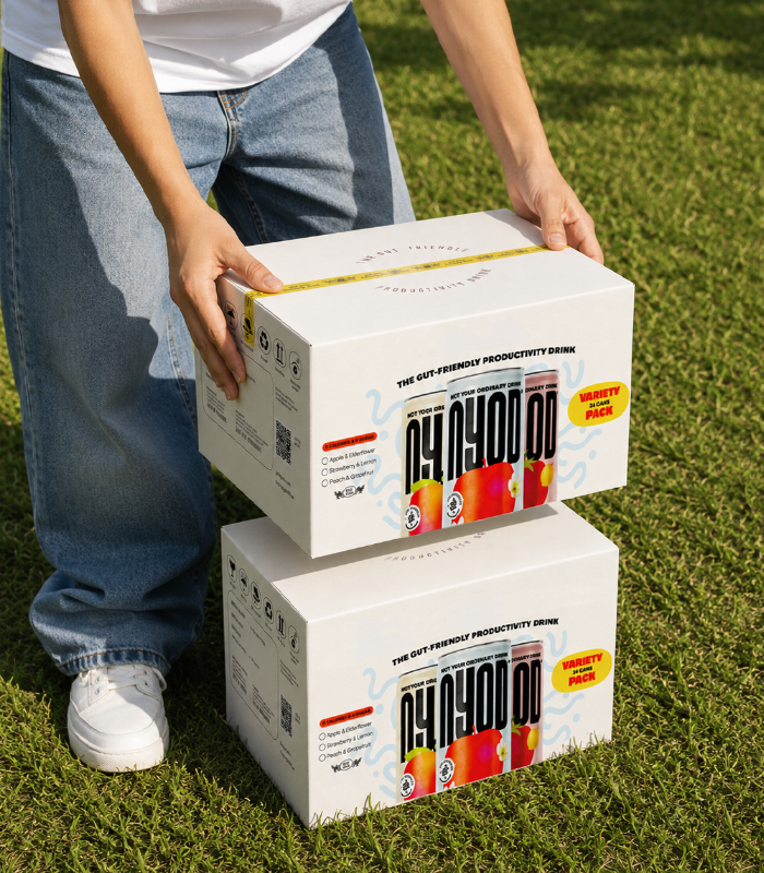
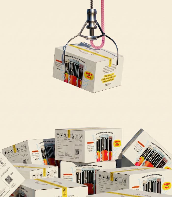
Packaging became a key touchpoint in bringing the brand to life. In a crowded category where every can is competing for attention and is dressed in complexity, we wanted NYOD to feel approachable from the very first glance. So, we developed a packaging system that feels distinctive on the shelf while remaining flexible across flavours and future extensions. The end product is a can that communicates function and personality in equal measure, giving NYOD a presence that feels as comfortable in a wellness aisle as it does on a social feed or in a fridge stocked for the week ahead. Because for all the work that went into building the brand, the drink itself tastes just as good.
As the world of NYOD expanded across the website and digital touchpoints, the same principles carried through. Together, the strategy, messaging, packaging, and digital experience work as one cohesive system, ensuring the brand shows up consistently wherever it’s found.
And that's how we made room for something out of the ordinary.