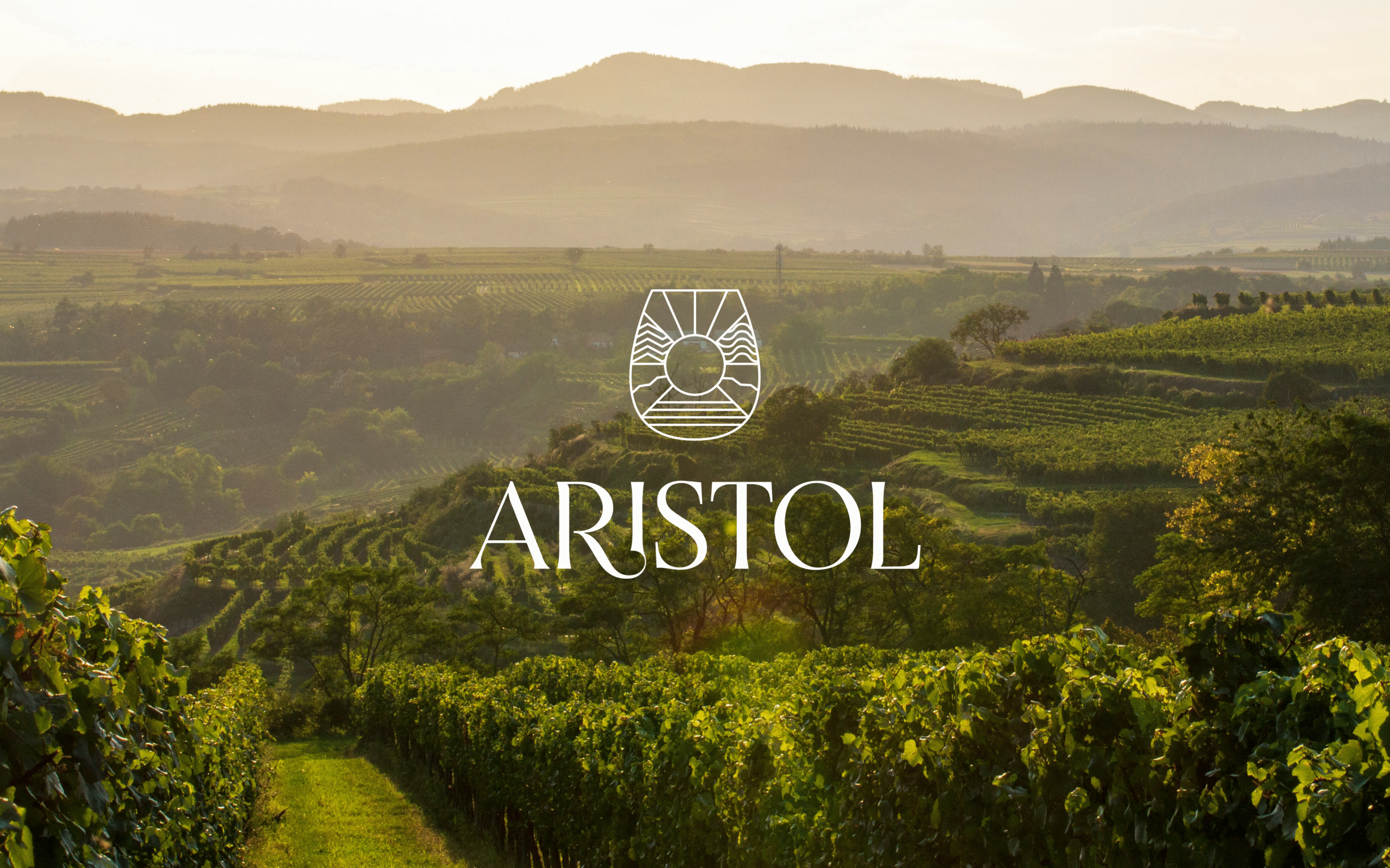
Aristotle walks into a bar...
the joke's history now, but the wine lives on.
Aristol is known for their prestigious offerings of select wines, spirits, and luxe hospitality. When they came to us in 2022, they had their internal brand structure set up but no identity. That's when we stepped in. We developed their brand identity, website design, style guide, office stationery, business decks and brochures, and their social media launch.
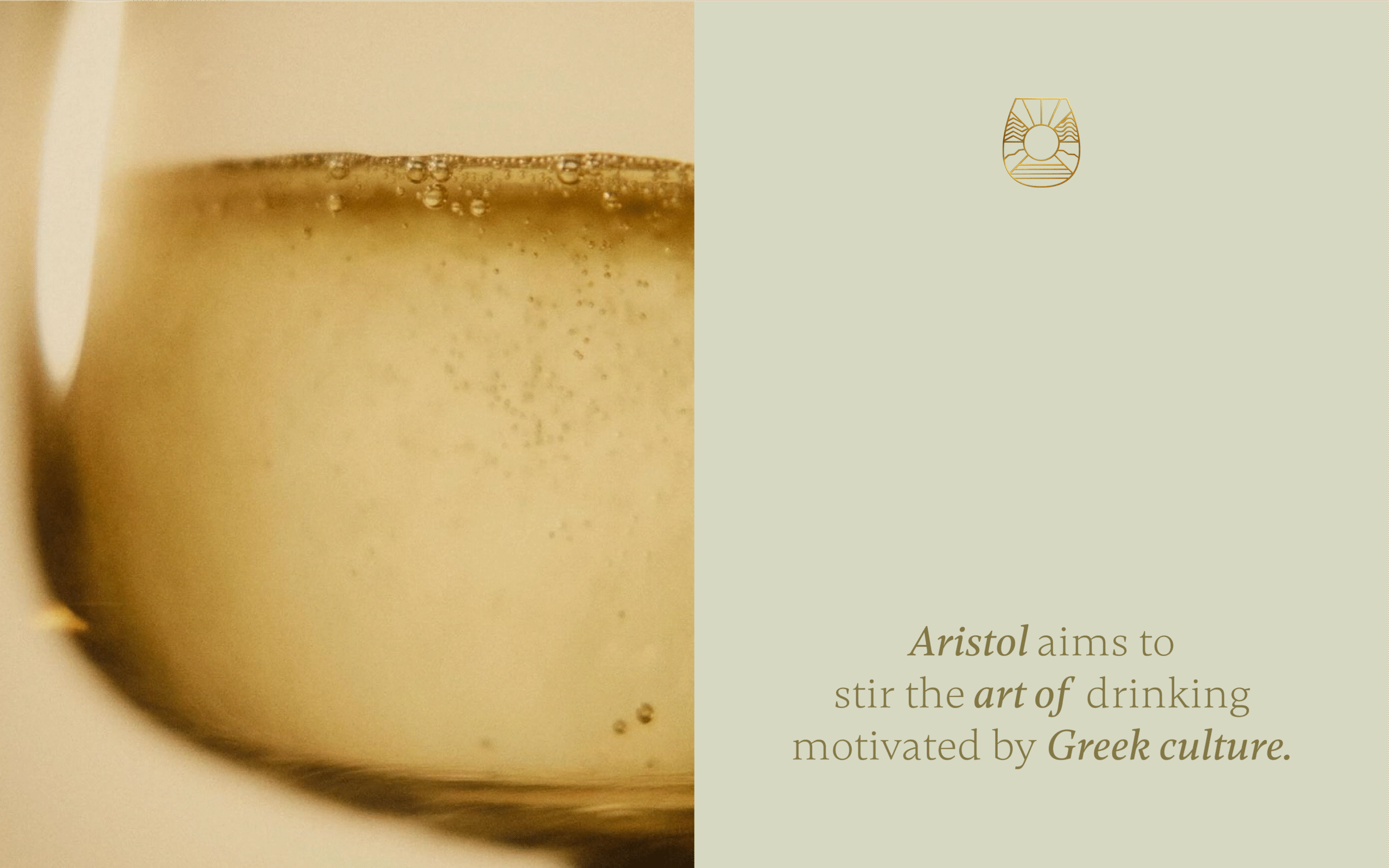
The seed idea of this brand was to bring the finesse and exuberance of European drinking culture to India. Bringing the culture was one thing, but they bought the products too. The cofounders made sure we understood that every bottle they chose to house was carefully selected, showing their decades of experience. For aficionados and enthusiasts alike, we knew this was going to be an exciting move.
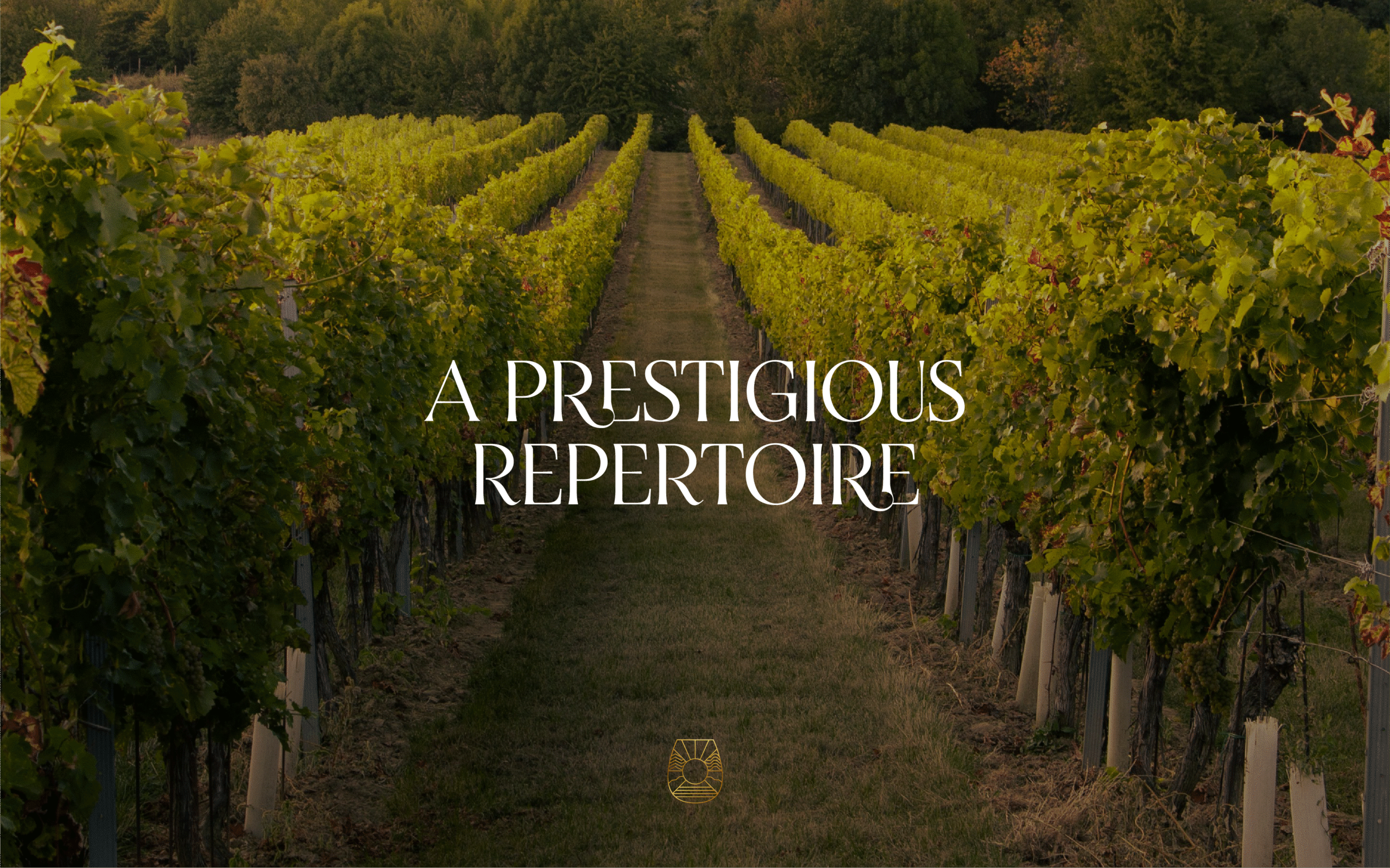
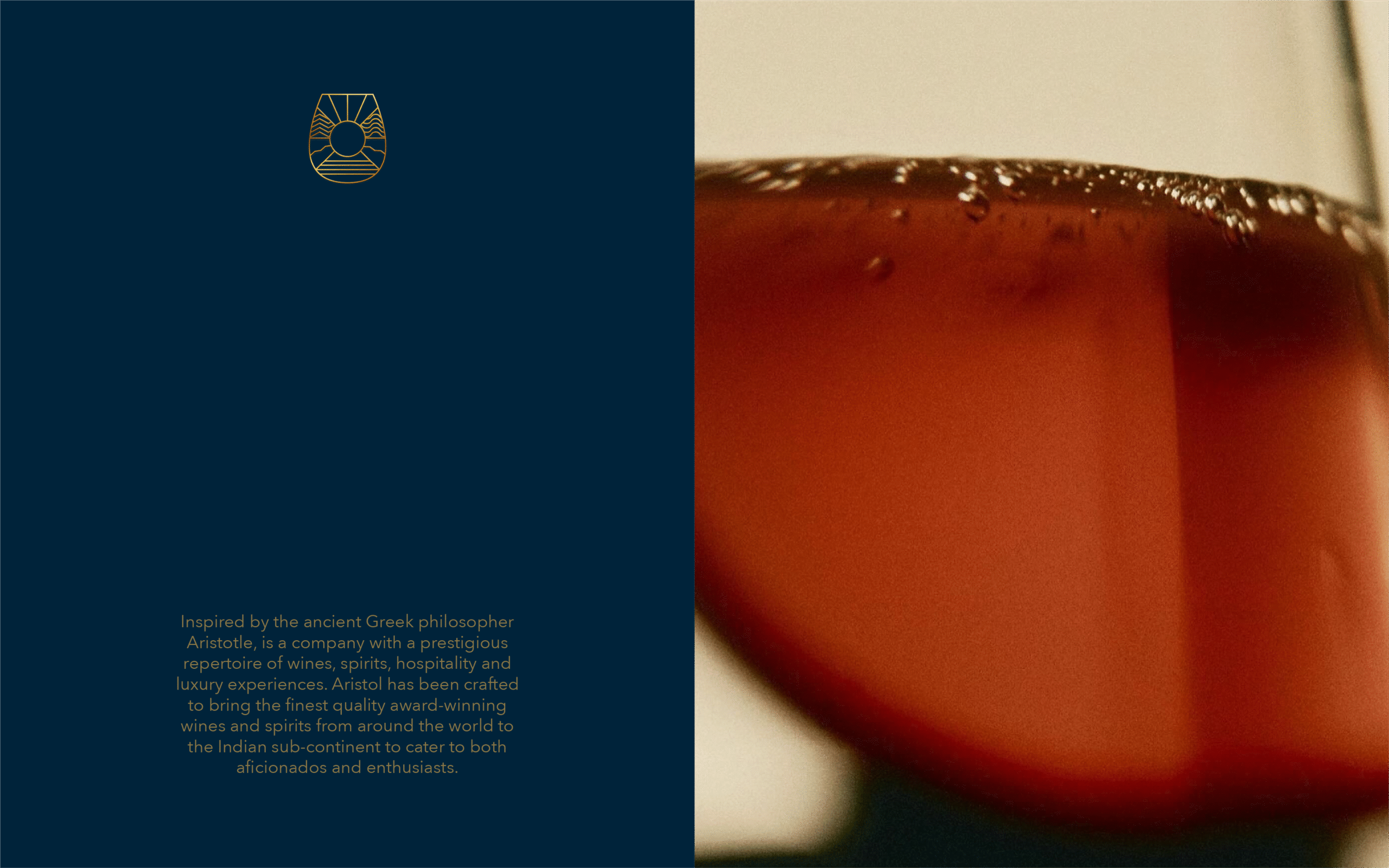
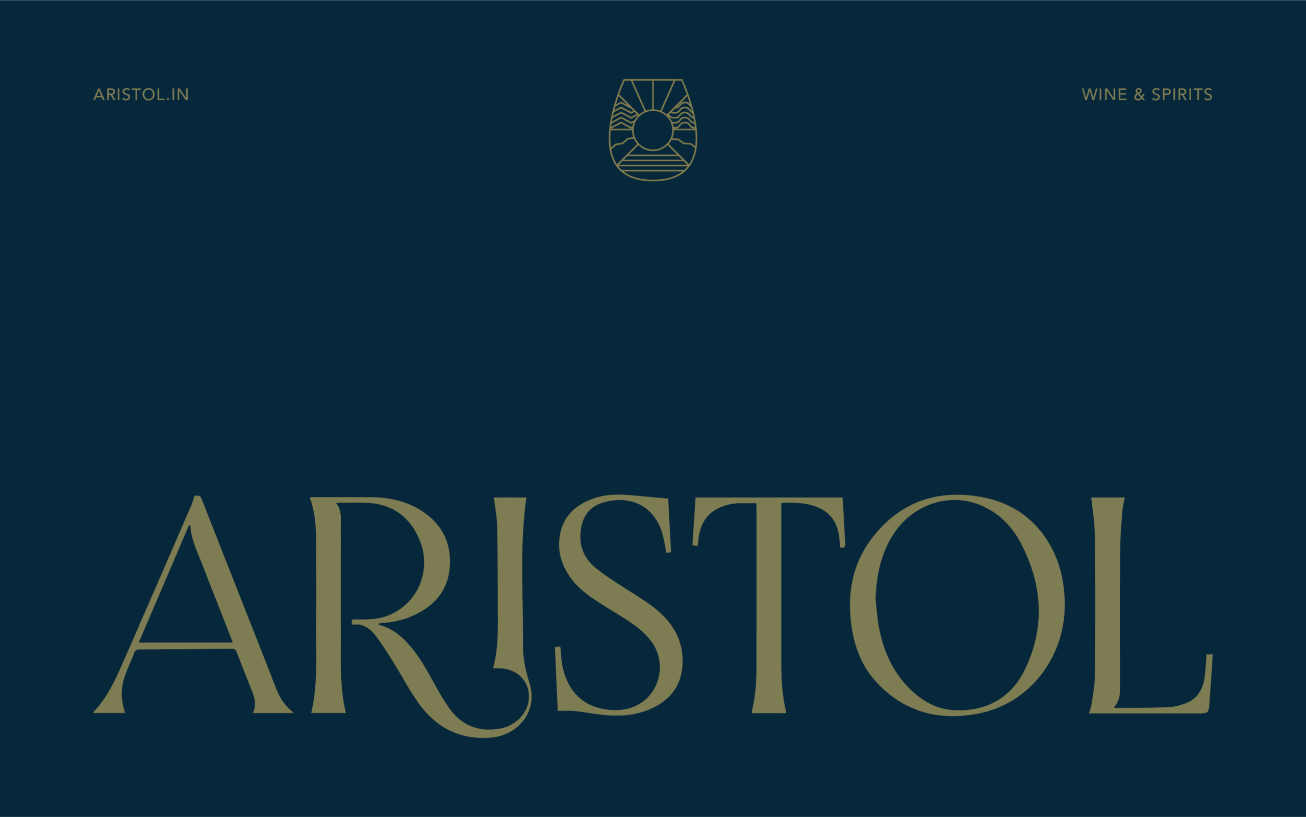
Our branding exercise started by defining what the brand was going to look like. The keywords that formed our foundation included: loyalty, excellence, regality, elegance, and flair. We wanted to design an identity that stood timelessly still with the evolving Indian consumer. The emblem we created was to represent the coming together of terrains and spirit, all within one goblet of sophistication. For the typemark, we used a graceful stylised sans serif to match.
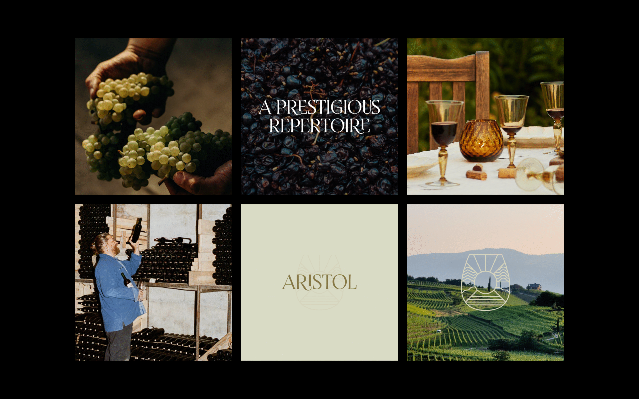
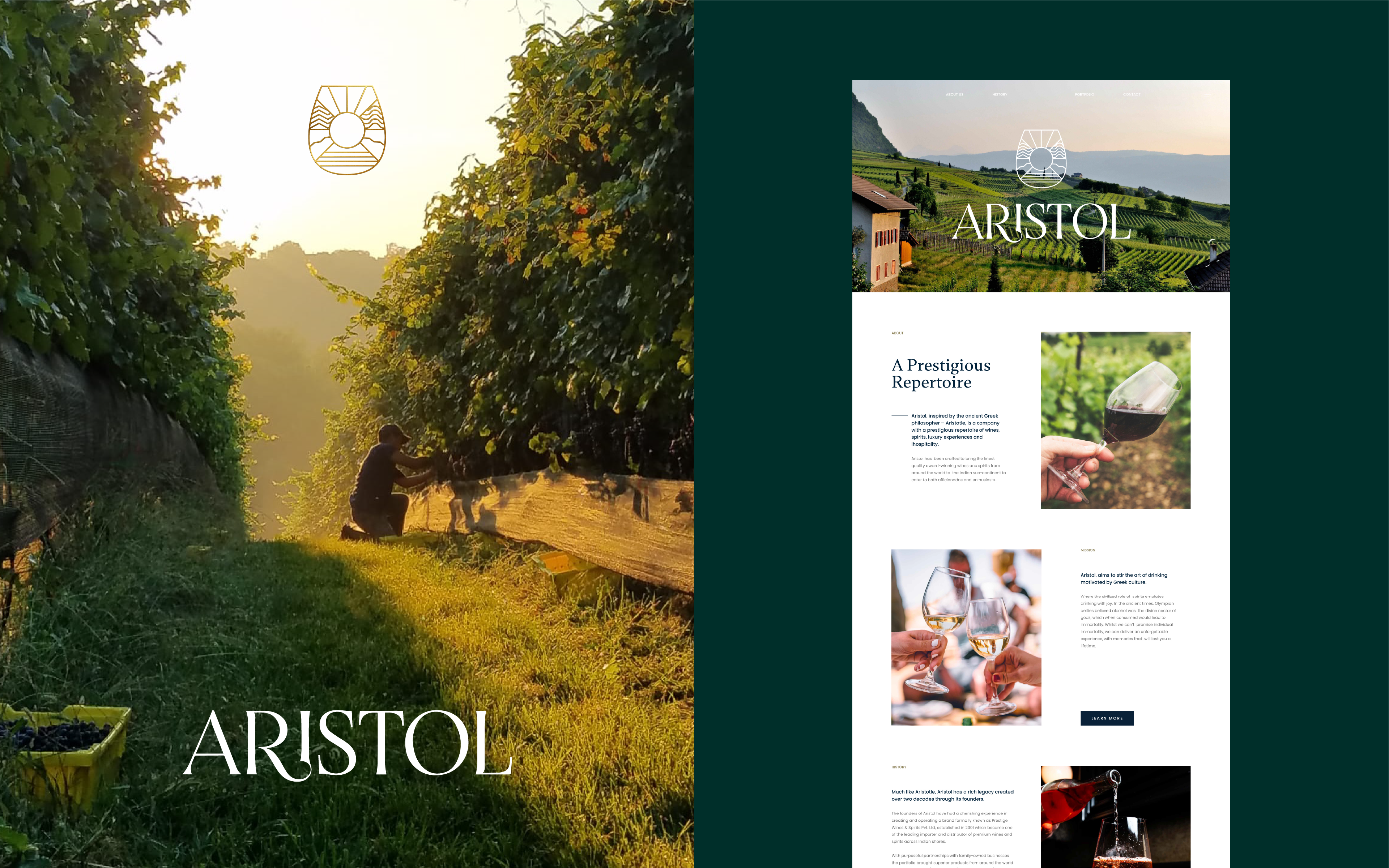
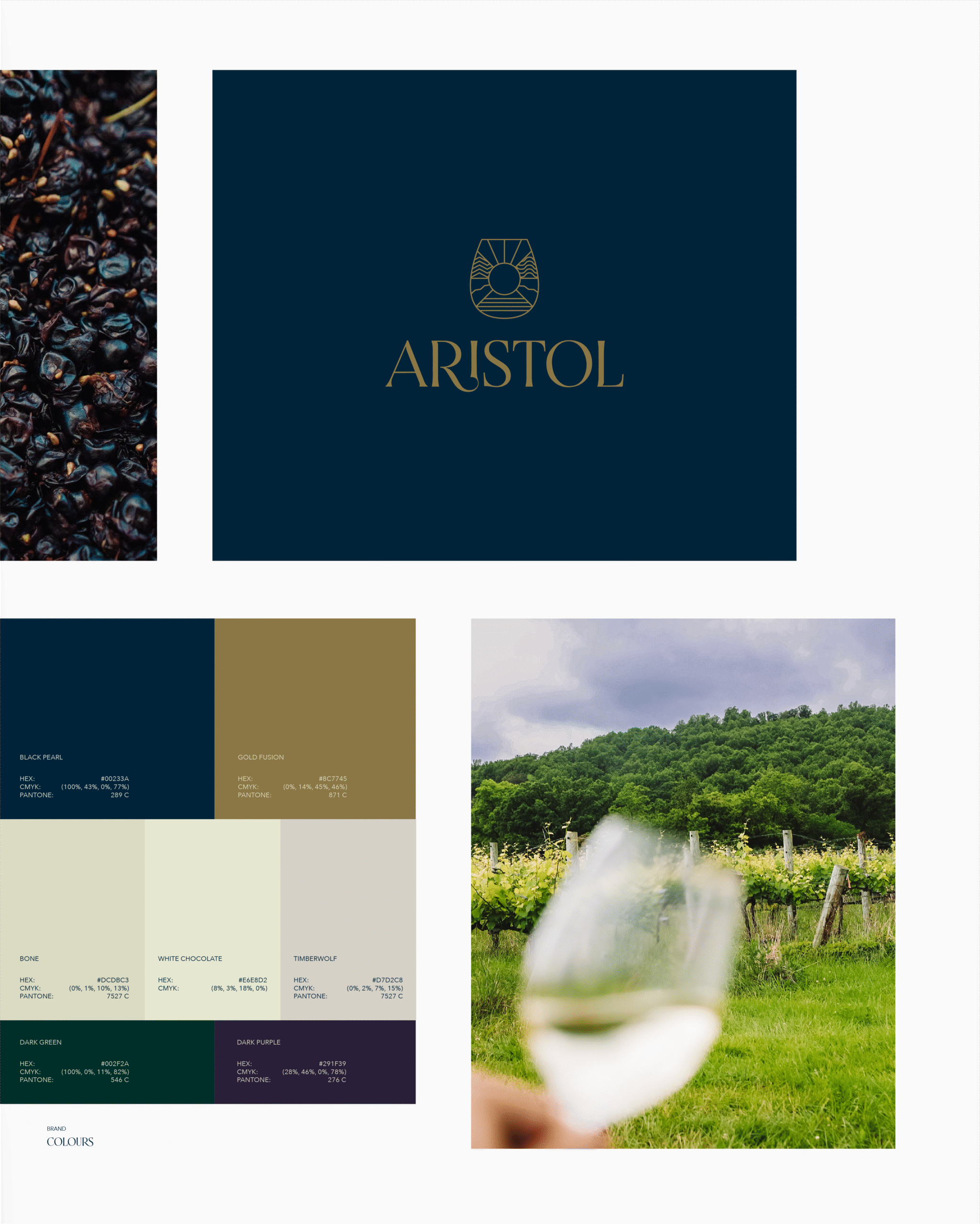

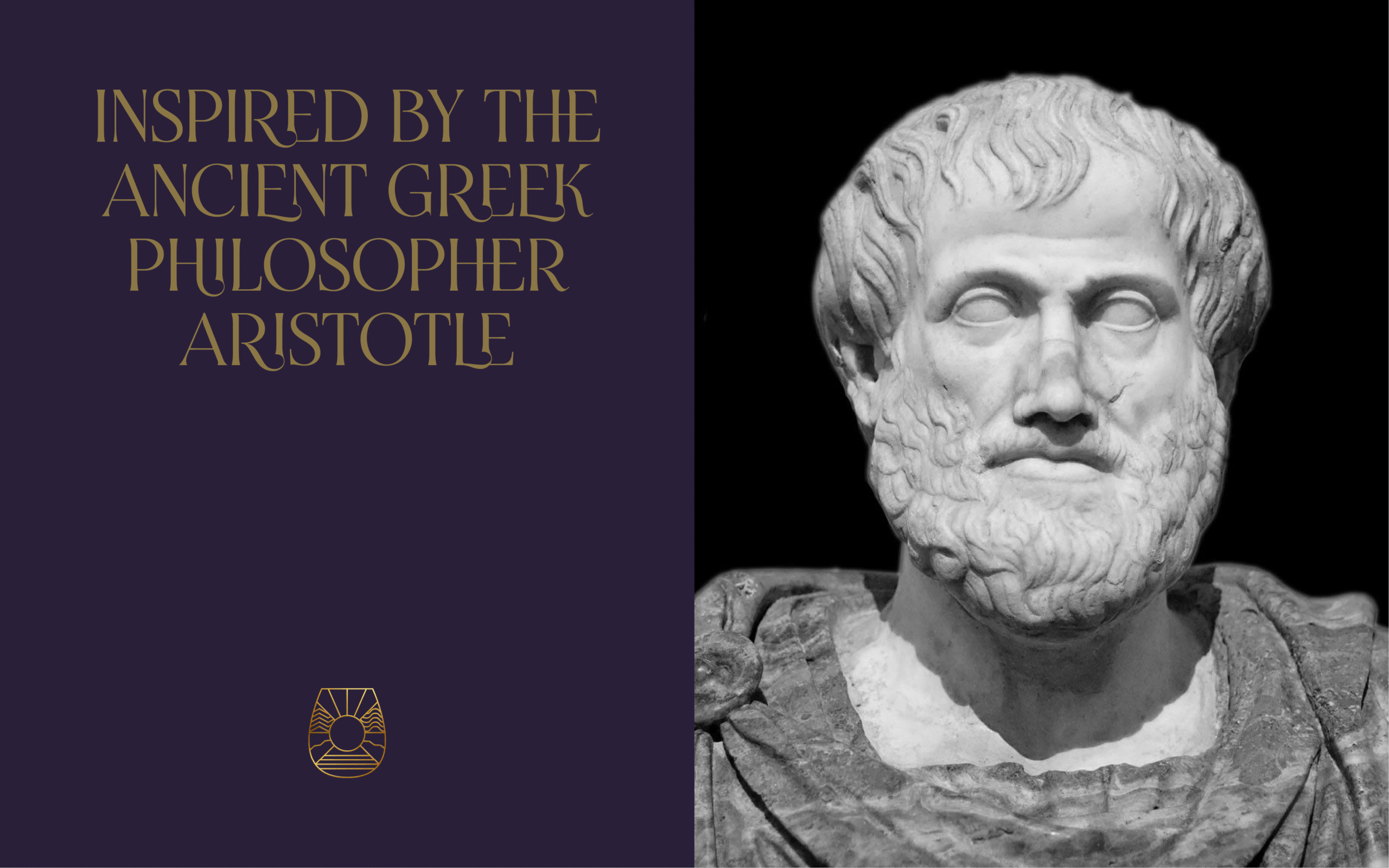
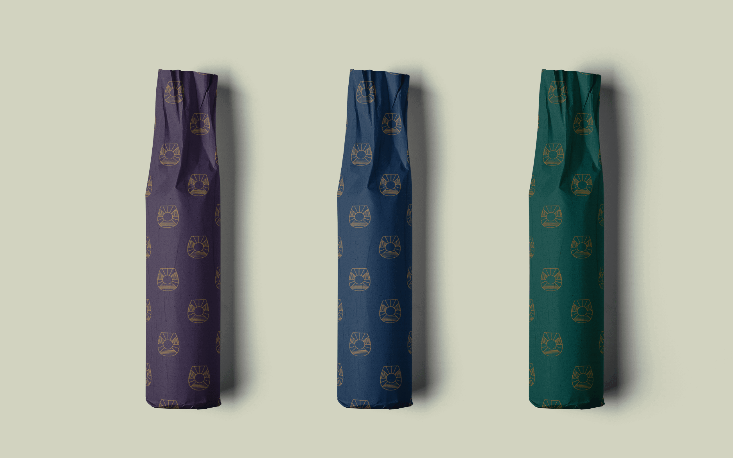
Then came the rest of the visual identity. We chose classy, greek-inspired colours that were rich and polished. To soften the tone and seem more approachable, we paired their primary sans serif with a readable serif for their brand fonts. Their brochure, deck, and corporate stationery came next, fusing together all these assets. For the website and social media launch, we kept things subtle and sweet with image-led mood building.
With Aristol, less was more and we kept it that way.

Copywriting: Arjun Chandra