A Deuce is anyone's game,
and everyone's place to be.
Deuce came to us with the blueprint of a restobar where sports and a good menu finally meet. With pickleball and paddle rising as global favourites, they wanted to bring that same energy home: sports as the entry point, social as the after-hours reward. And that’s where we stepped in to design a brand identity system that can move between the two worlds.
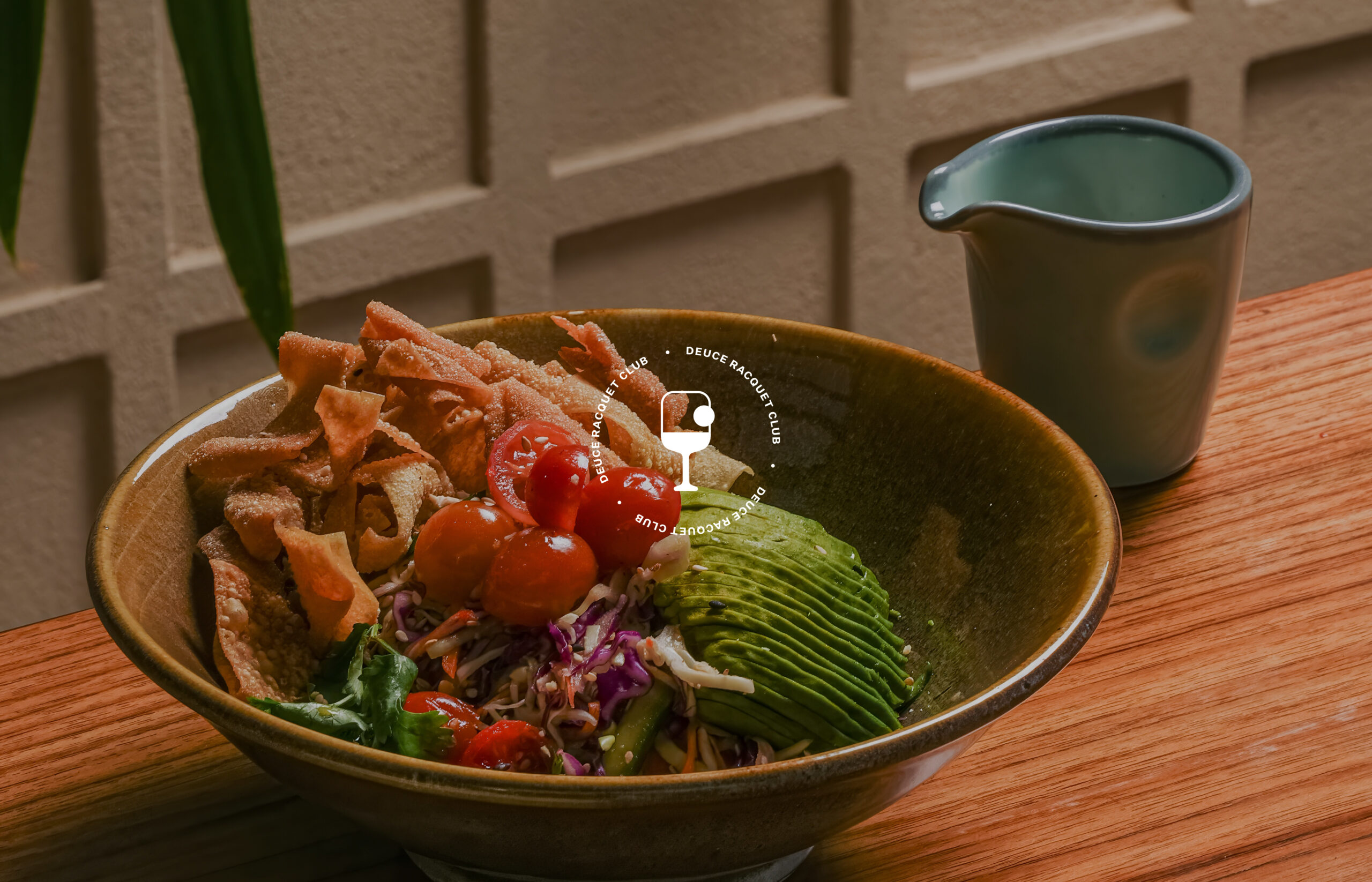
In sports, a Deuce is a marker of balance, when both sides are tied, and the game could go either way. We used that as a thought starter and anchored the brand’s design to have that poise in play. To feel strong yet fluid, structured yet social. It borrows from the seriousness of a country club, but lightened to feel contemporary and friendly, much like pickle and paddle themselves. The iconmark carries that idea forward, where a racquet hides a martini glass within it. A little moment of duality, built into a single shape, becoming the shorthand for how the brand moves.
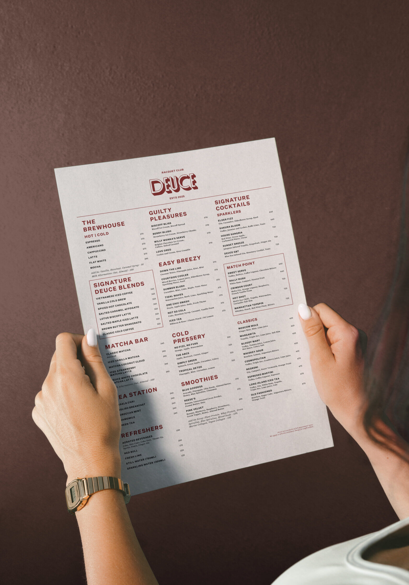
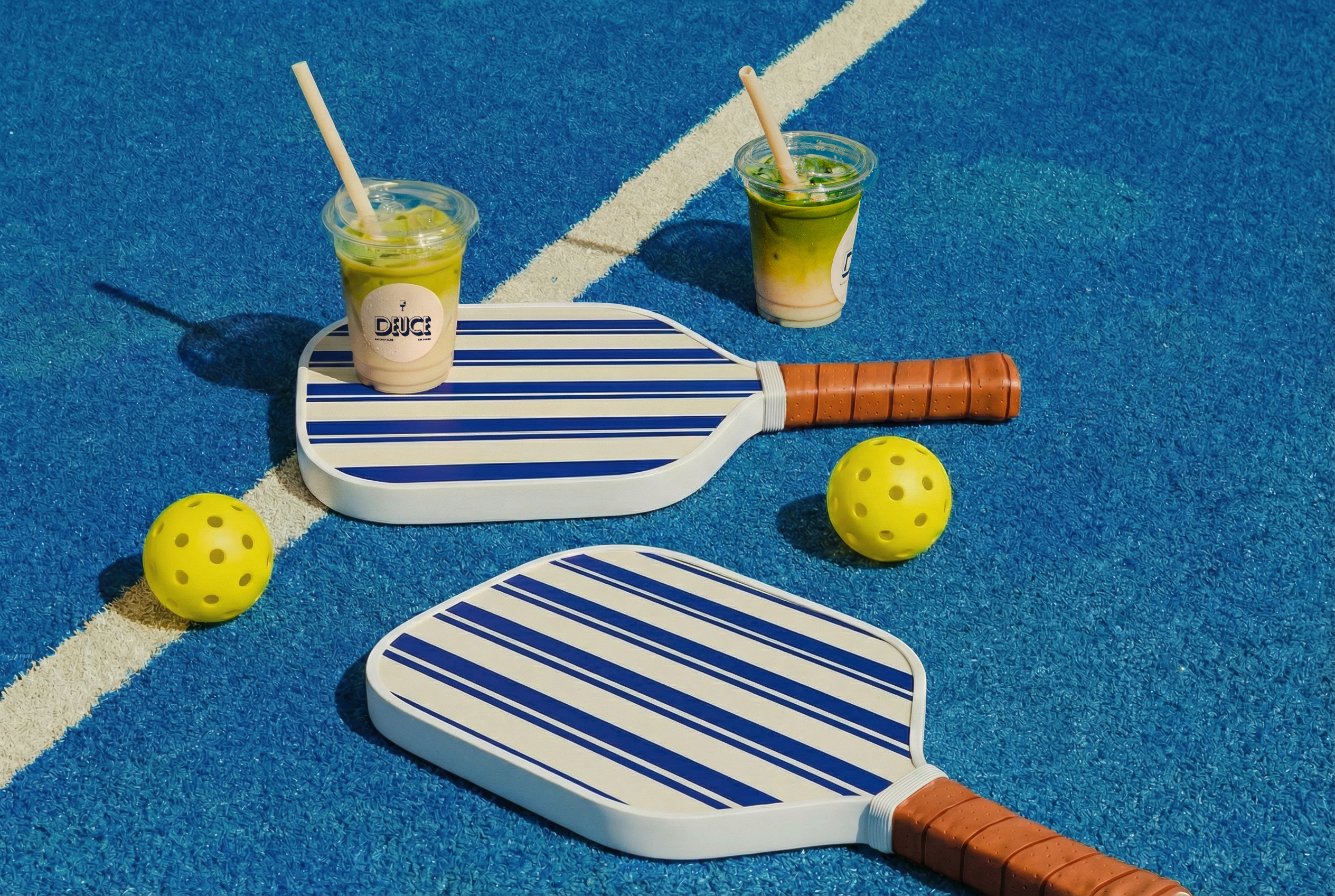
We balanced the palette with cooler blues, as a nod to its rooftop setting, suspended above the city, closer to the sky than the ground. The inviting red and neutral undertones rounded it out for the perfect after-hours plan. Typography became another way to bridge worlds. The sans, slightly wider and shorter, draws from scoreboards and sports screens that inspire legibility. The serif lends some warmth and indulgence, almost like the detour from the court to the bar.
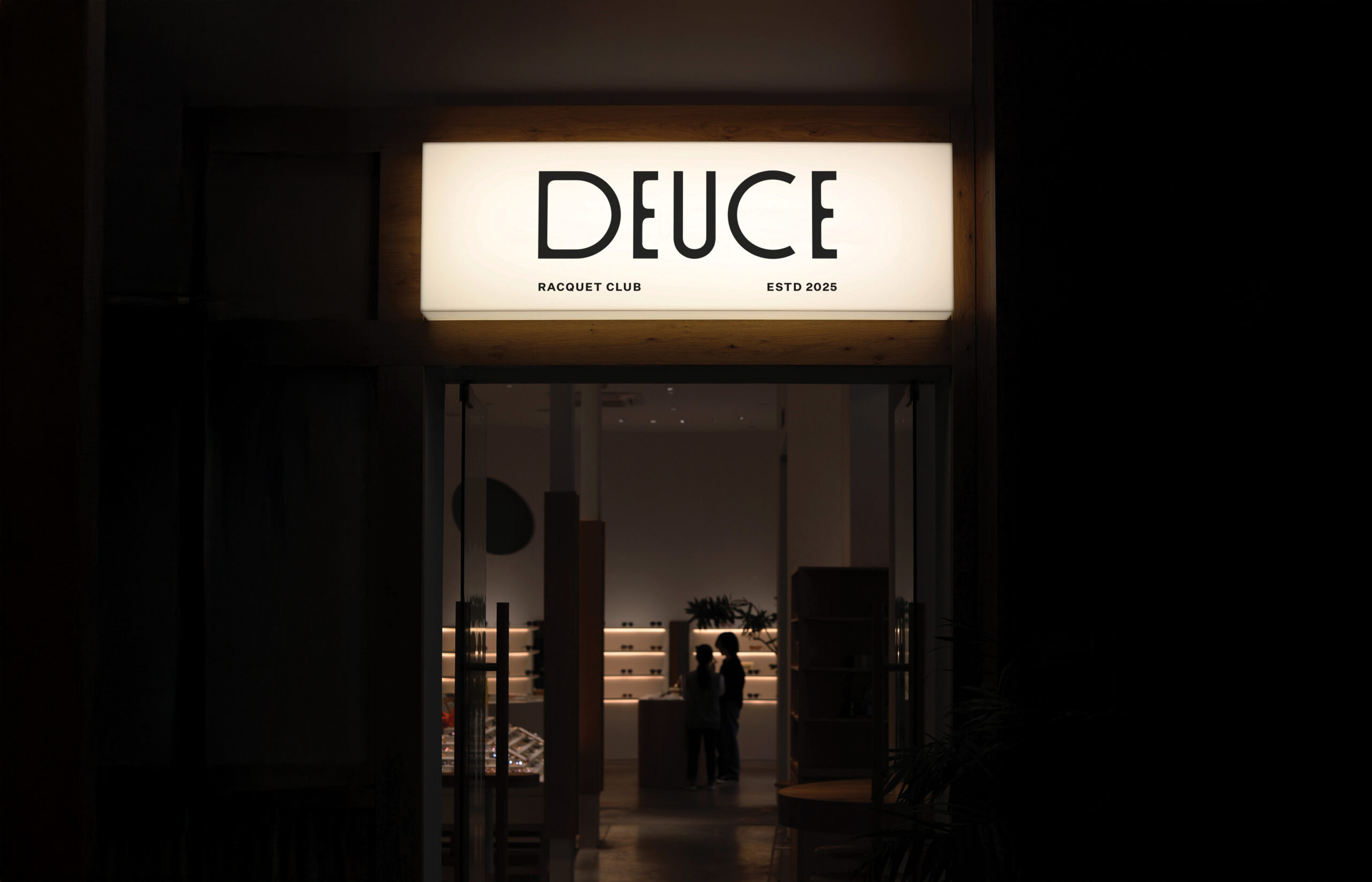
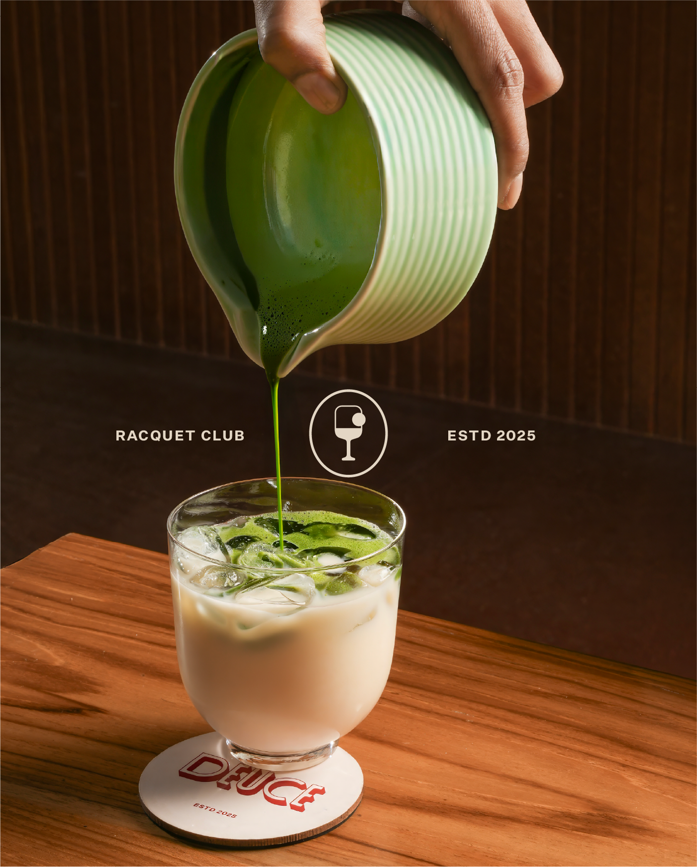
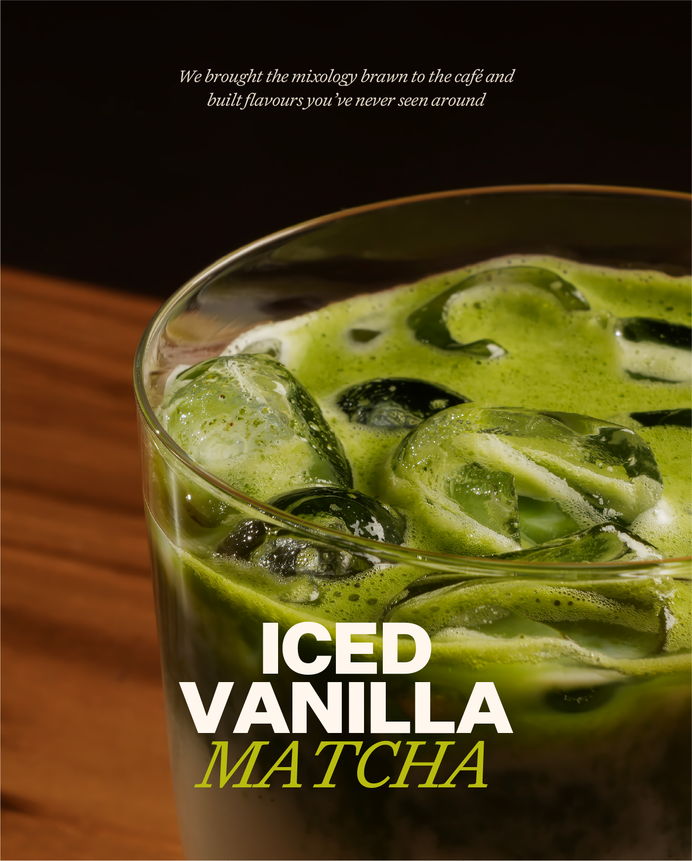
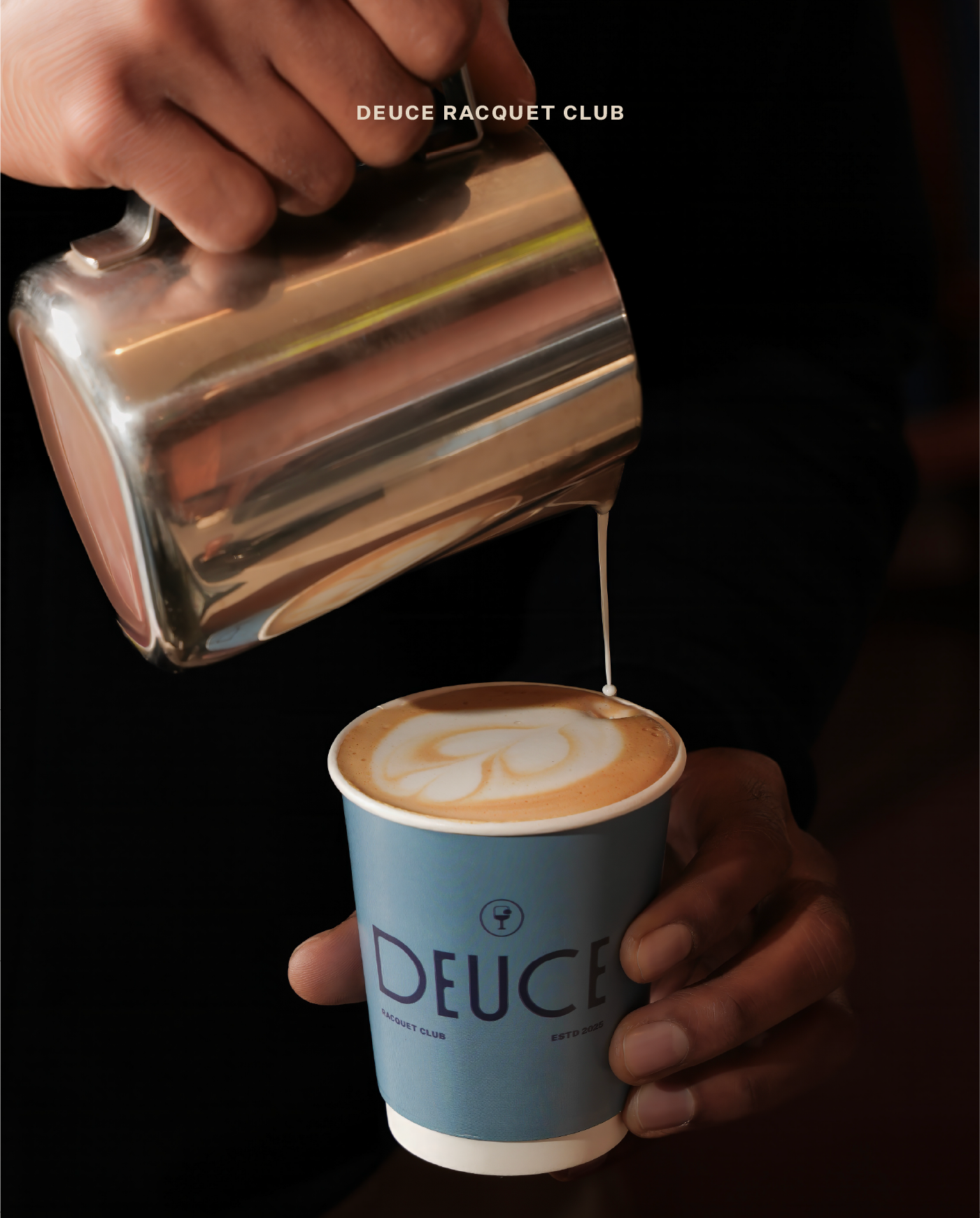
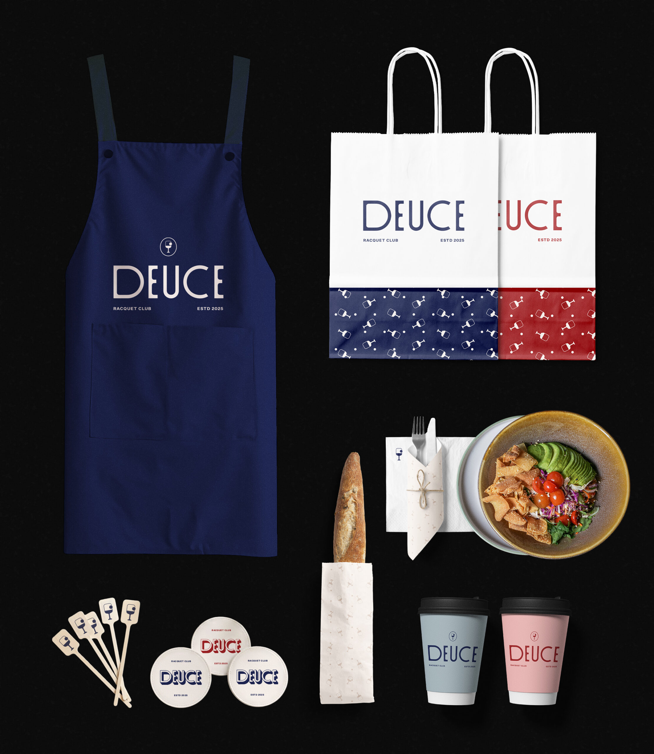
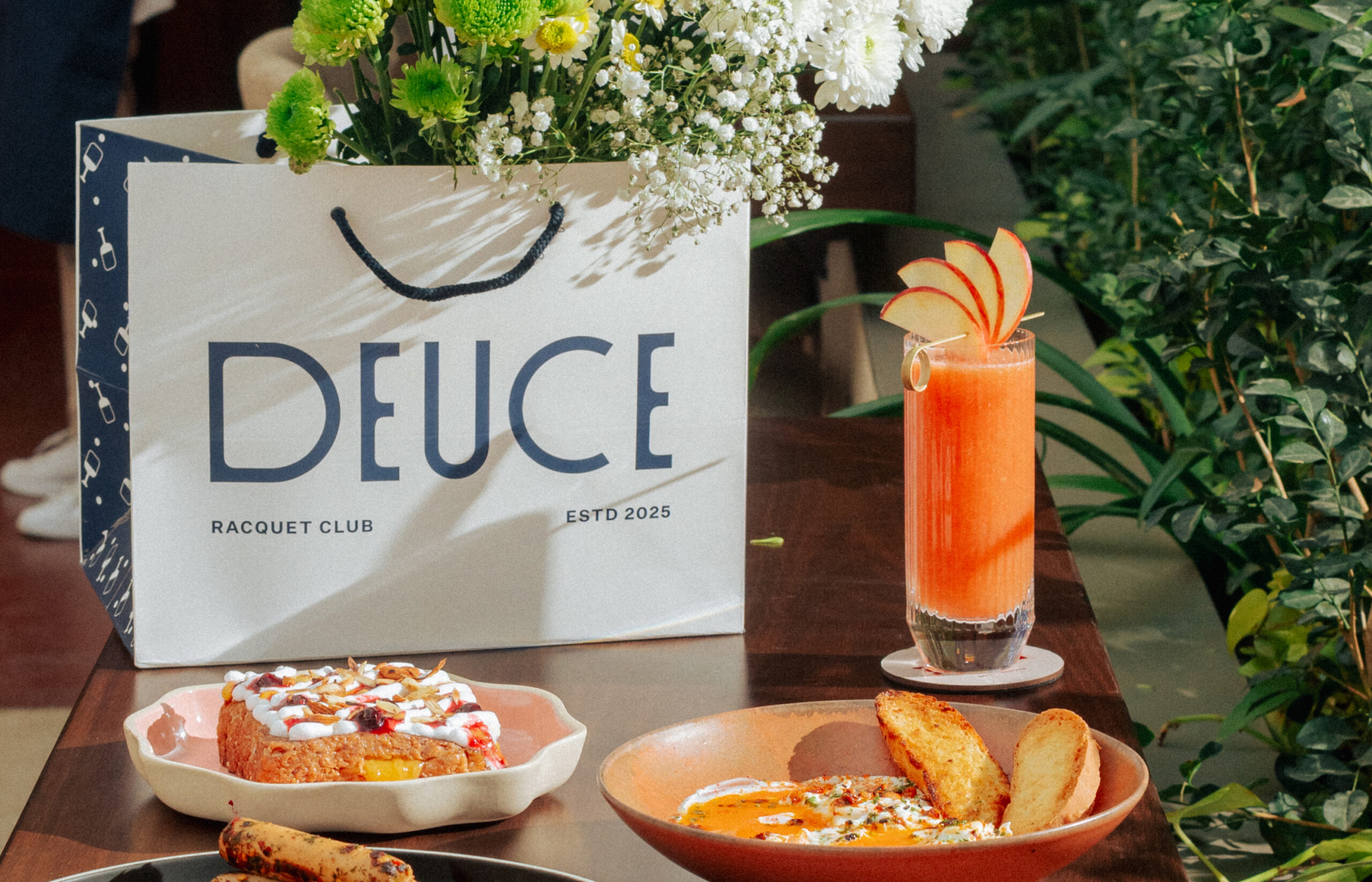
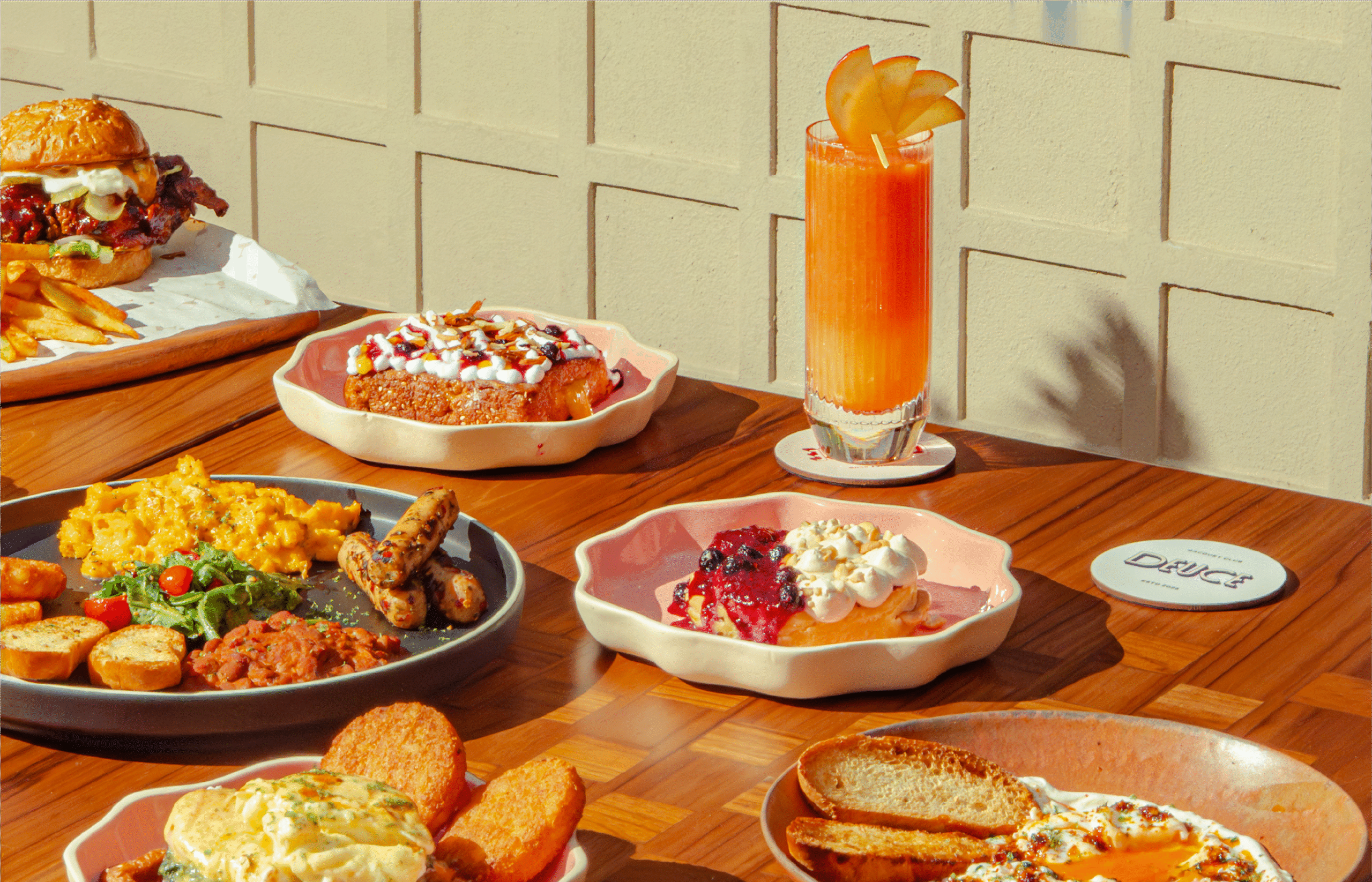
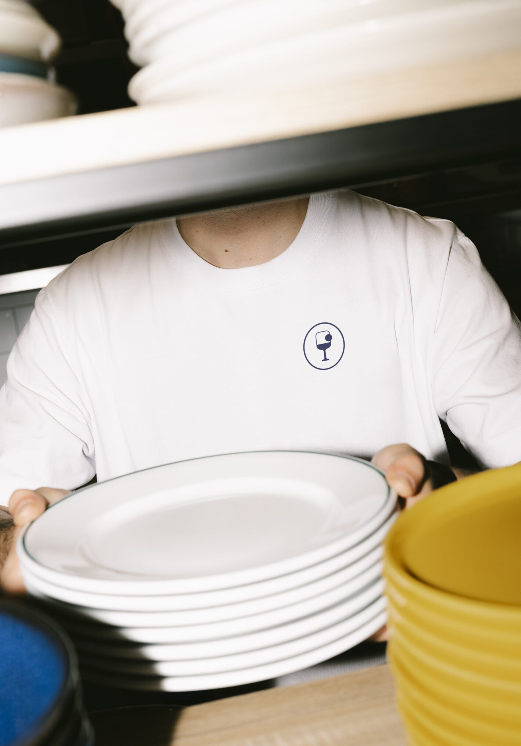
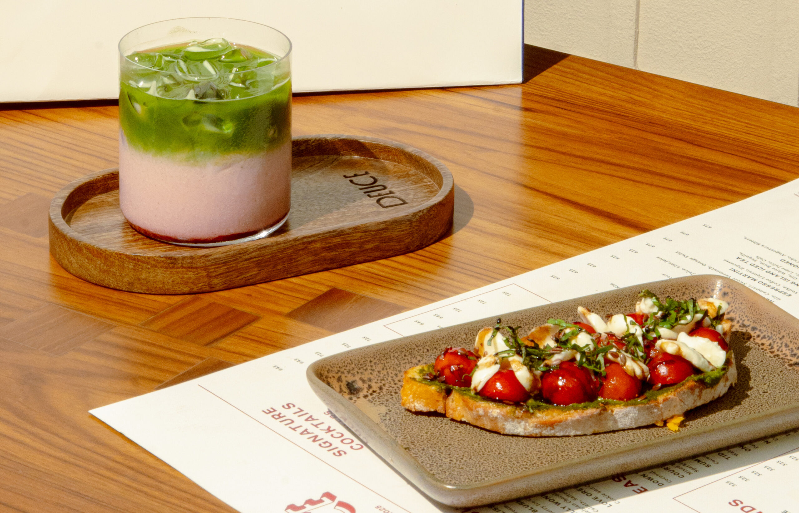
Then we added uniforms, menus, coasters, takeaway bags, stirrers, and rooftop signage into the mix. The uniforms blend athletic formality with everyday ease, while the signage sits against the skyline, holding its own glimmer. Small elements like takeaway cup sleeves and stirrers carried that sense of sport meeting social. Every touchpoint is built toward the idea of a “third place” that becomes a part of the city’s routine.
And when you’re with the right people, you don’t need to keep a score.
