Come fall in love,
just like we did.
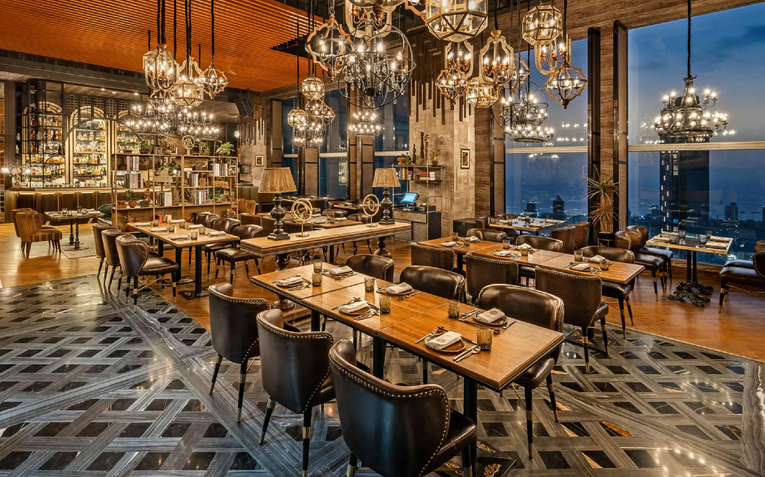
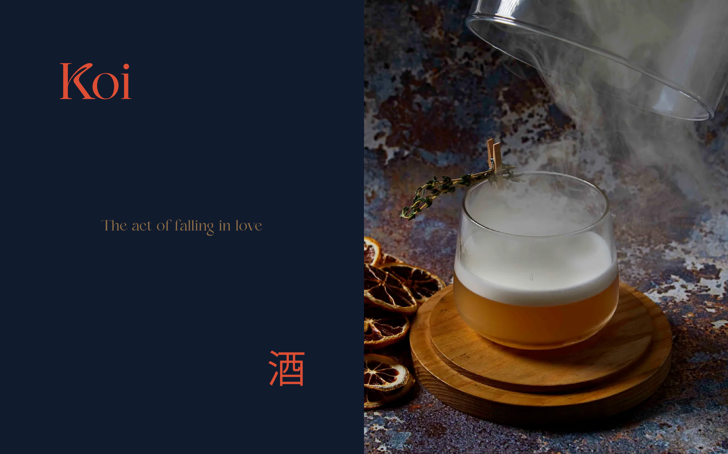
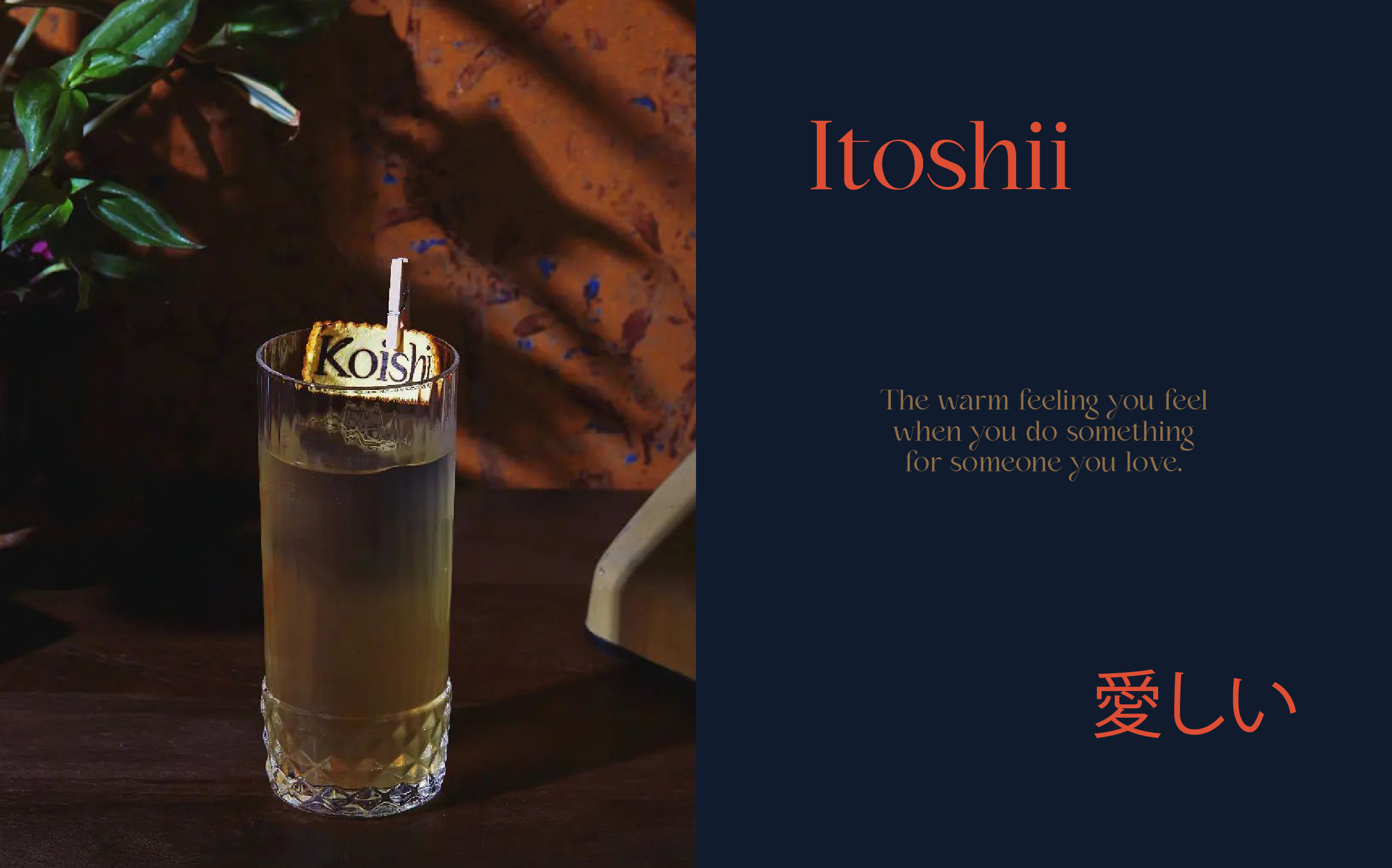
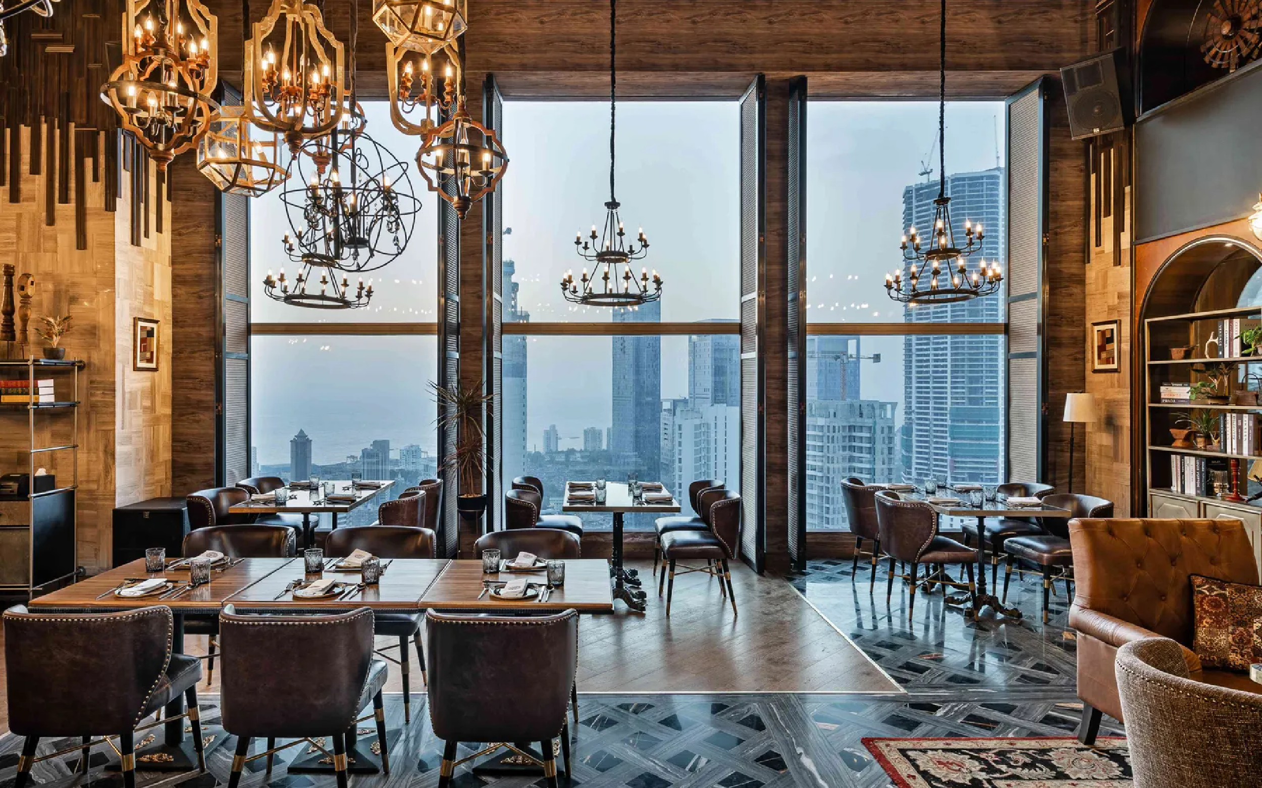
A restaurant located at the penthouse level of St. Regis. Mumbai, Koishii’s brief was to stand tall – making a mark above the rest. The name Koishii is rooted in two words; Koi, the act of falling in love and Itishi, the warmth you feel when you do something for the one you love. We dug deeper into this meaning, one of longing and the state of being in love – being in love with travel, people, moments, and most importantly, two dynamic cultures.
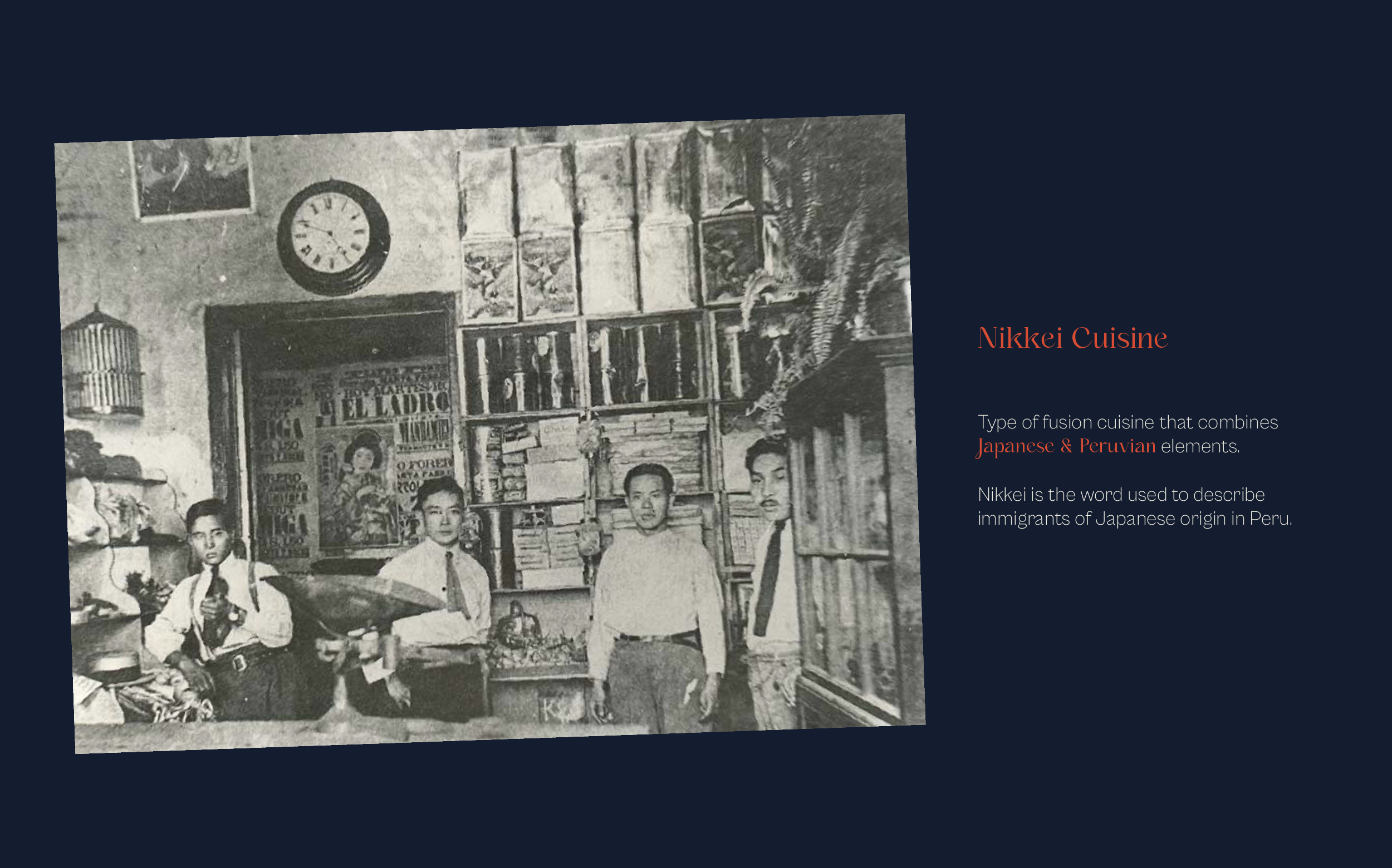
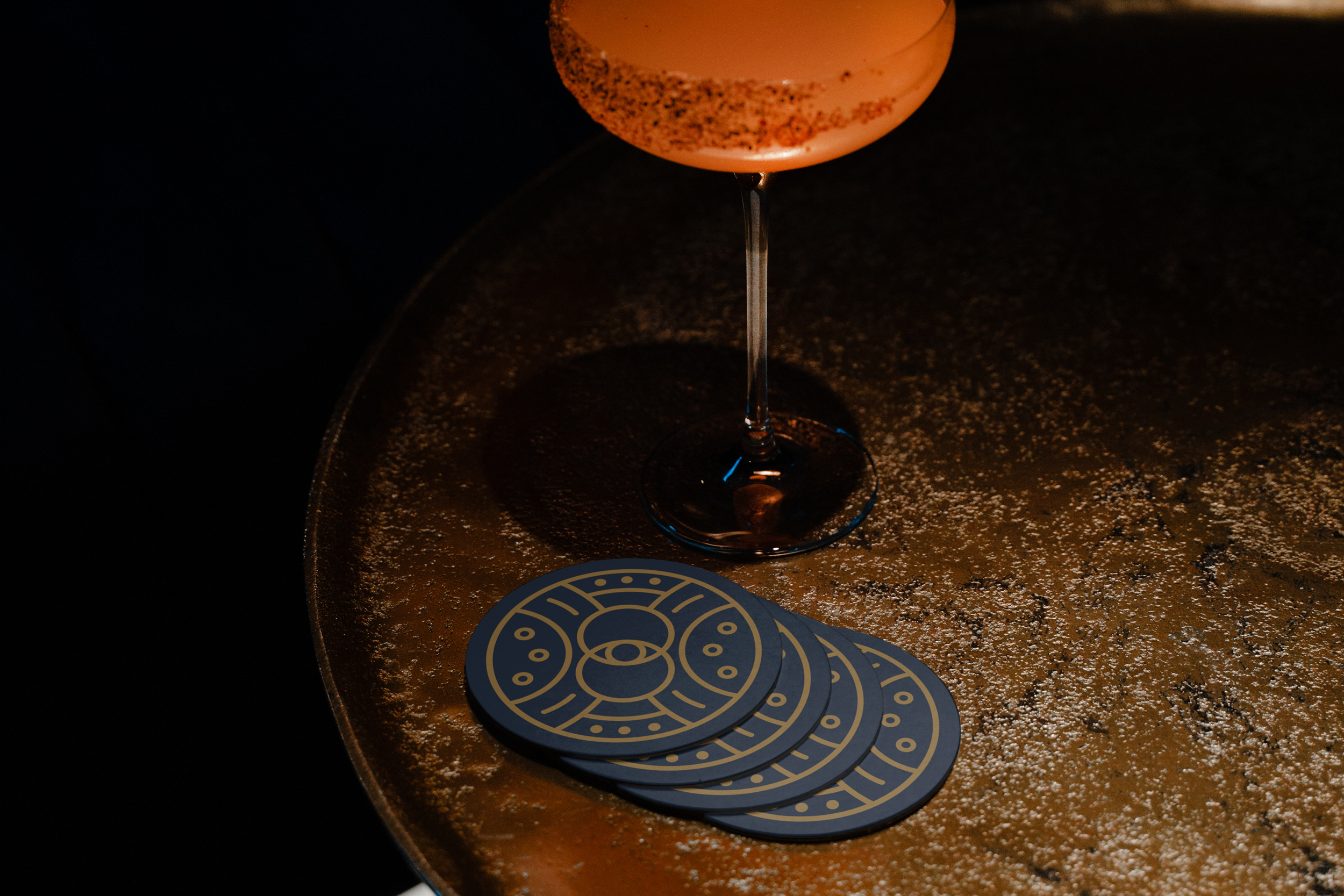
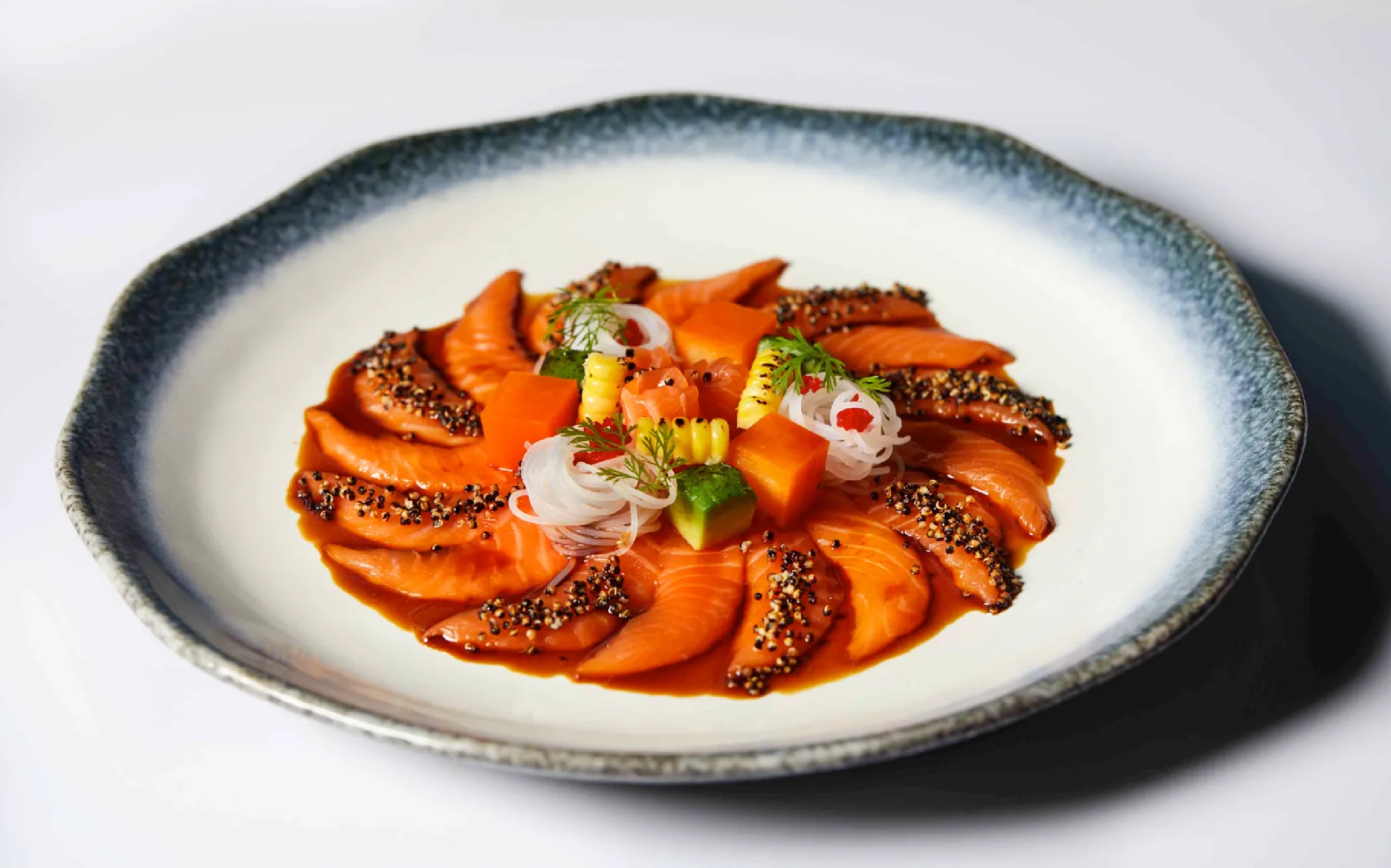
We travelled through history and discovered the journey that brought together Peruvian ingredients and Japanese culinary techniques. We designed a style that marries two ends of the world to bring out flavours like no other. With days beginning in Lima’s Plaza de Armas and nights ending in Shibuya, Tokyo, we developed Koishii’s brand story, collaterals, and identity with love and for love.
