They say fortune favours the bold,
we couldn't agree more.
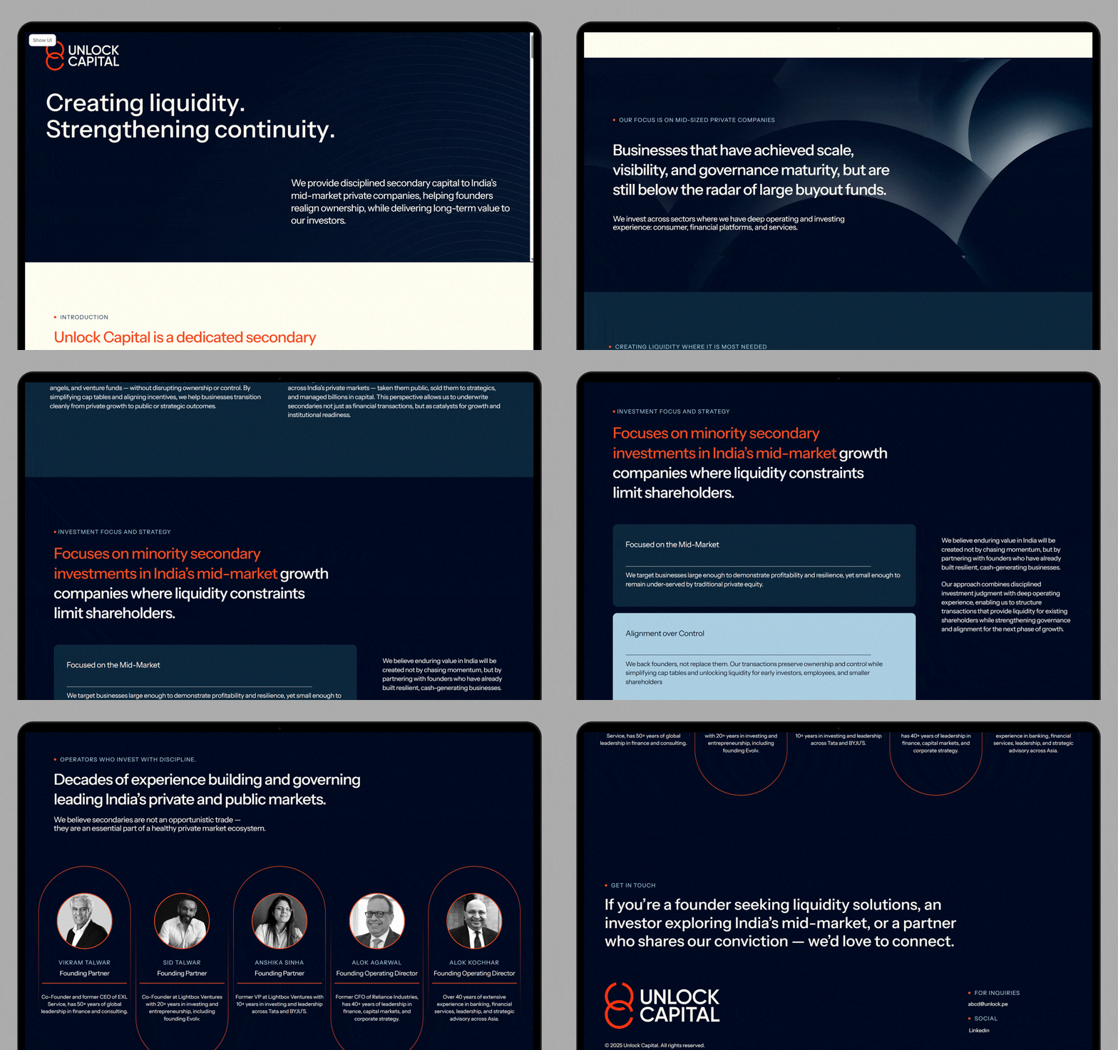
Unlock Capital operates within the private equity secondary market. Their deep knowledge on this space led to a finding — why do all these companies look so similar and how can we stand out? That’s when we came into the picture. We worked on their identity, website, presentation templates, and office stationery.
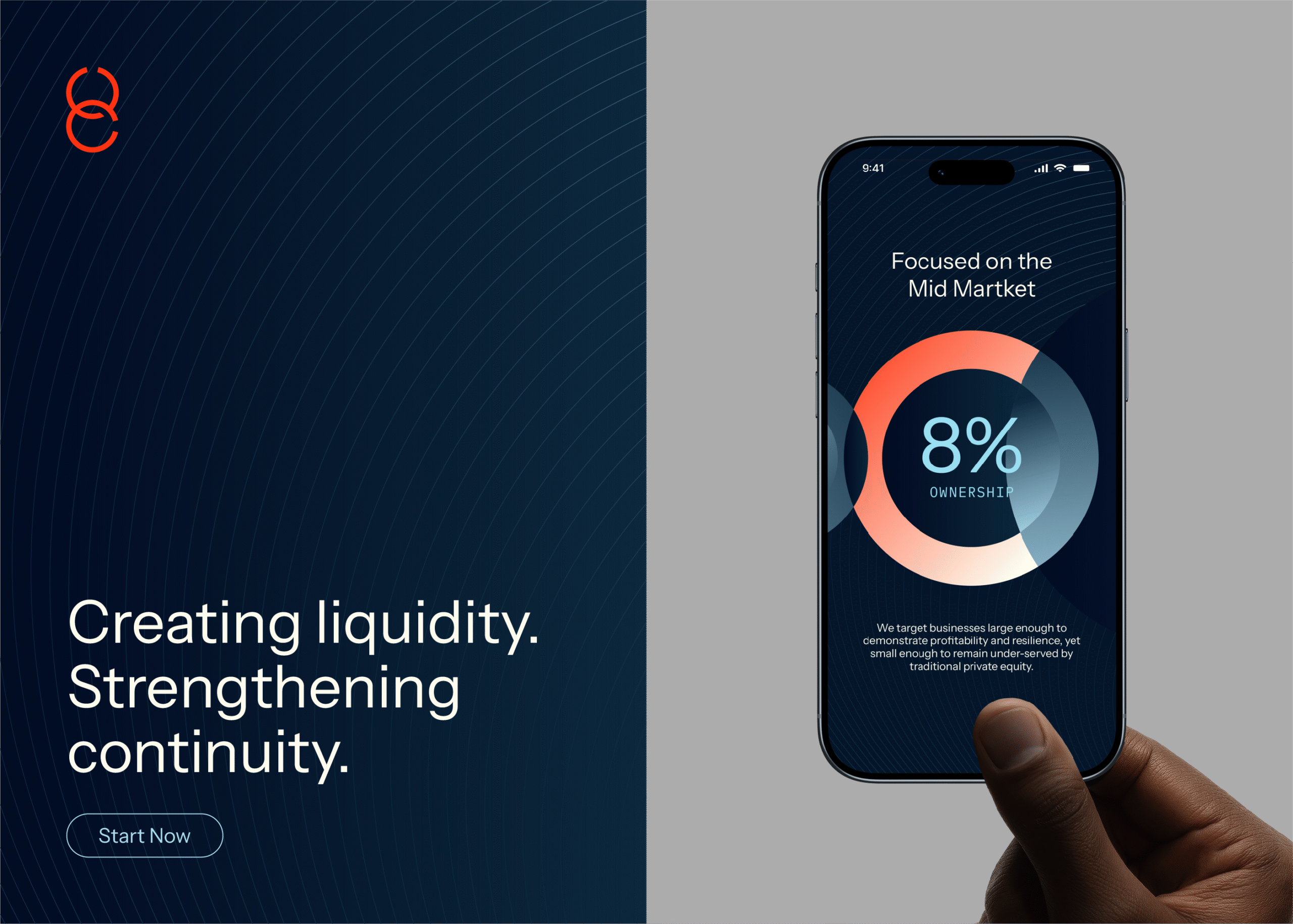

The team behind Unlock Capital was sure footed. They knew looking dismissive wasn’t an option. Instead, the keywords they wanted conveyed through the designs were: credibility, intelligence, assurance, and dependability. So we got to work and came up with an identity that was clean, professional, and yet away from the norm
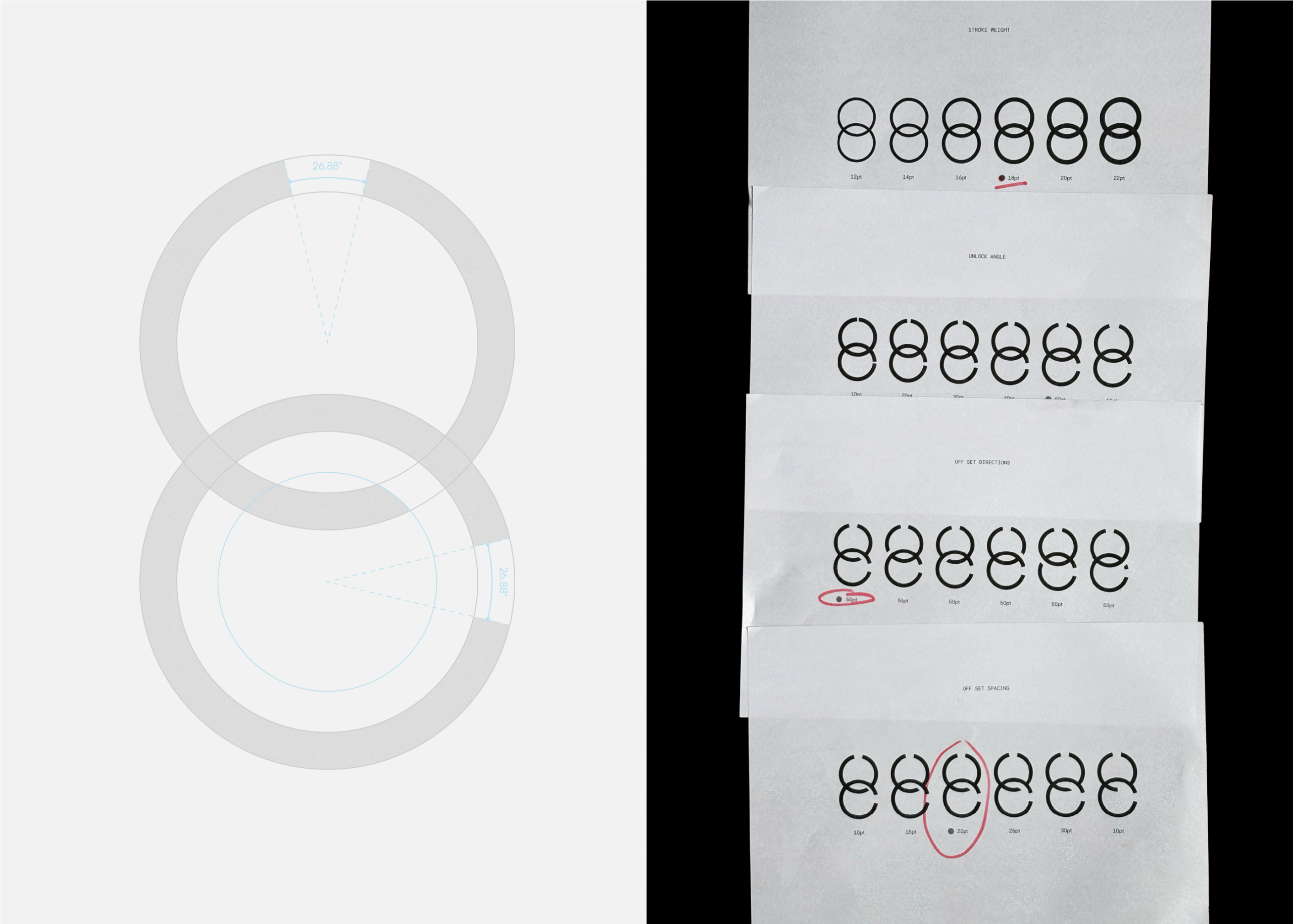
It all started with the primary icon mark. Two overlapping circles with breaks to symbolise the word ‘unlock’ (and also the letters ‘U’ and ‘C’). This default icon was then used across all collaterals, showing the connection between shareholders and founders. We matched this with a crisp, all-caps word mark to lock in the identity.
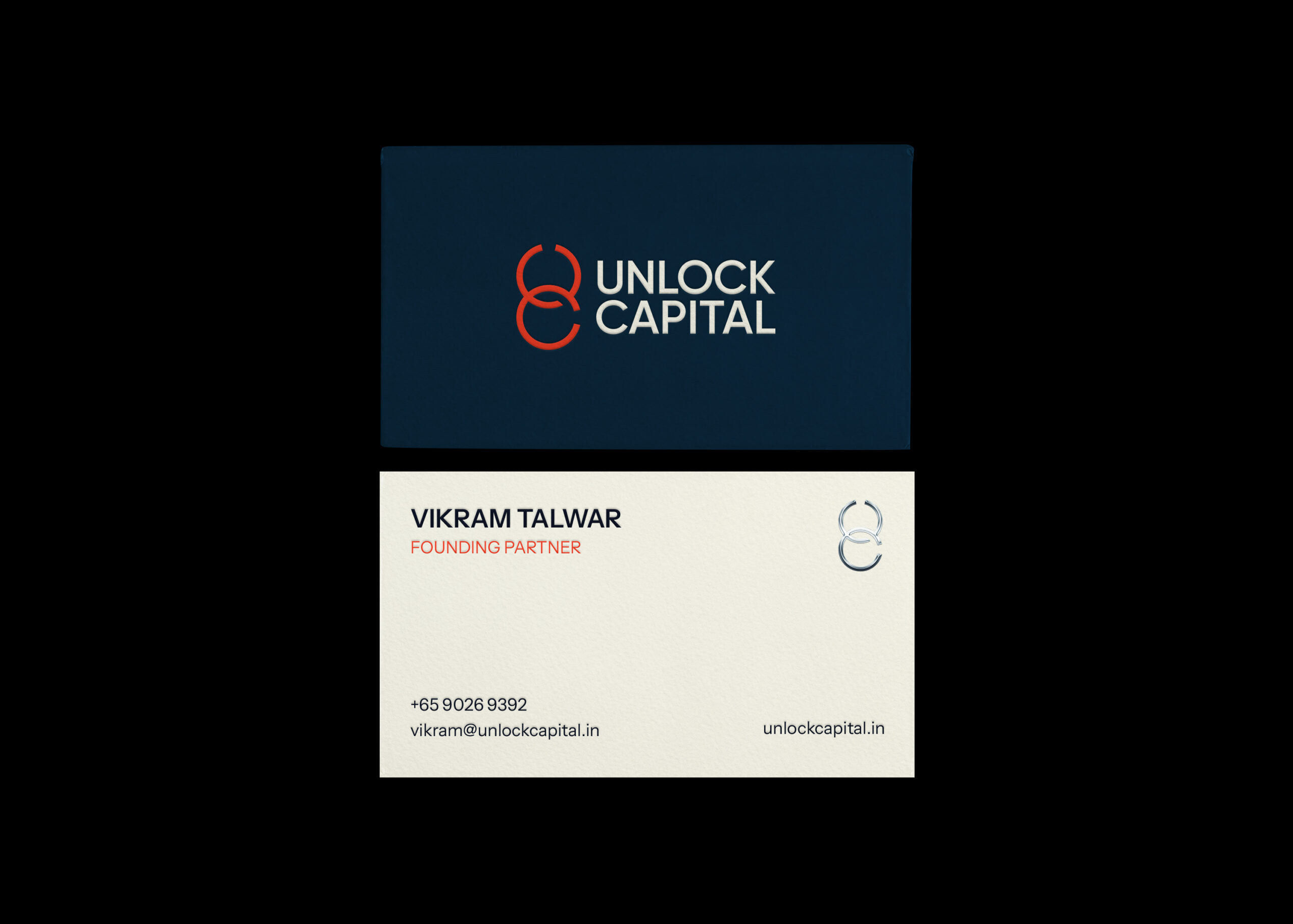
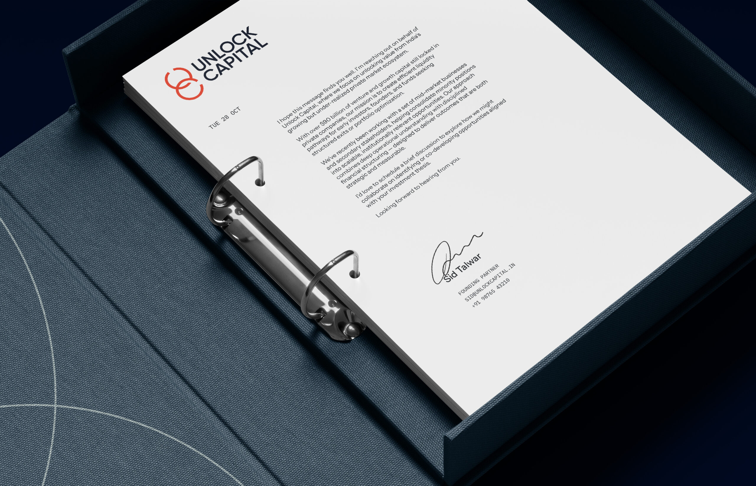
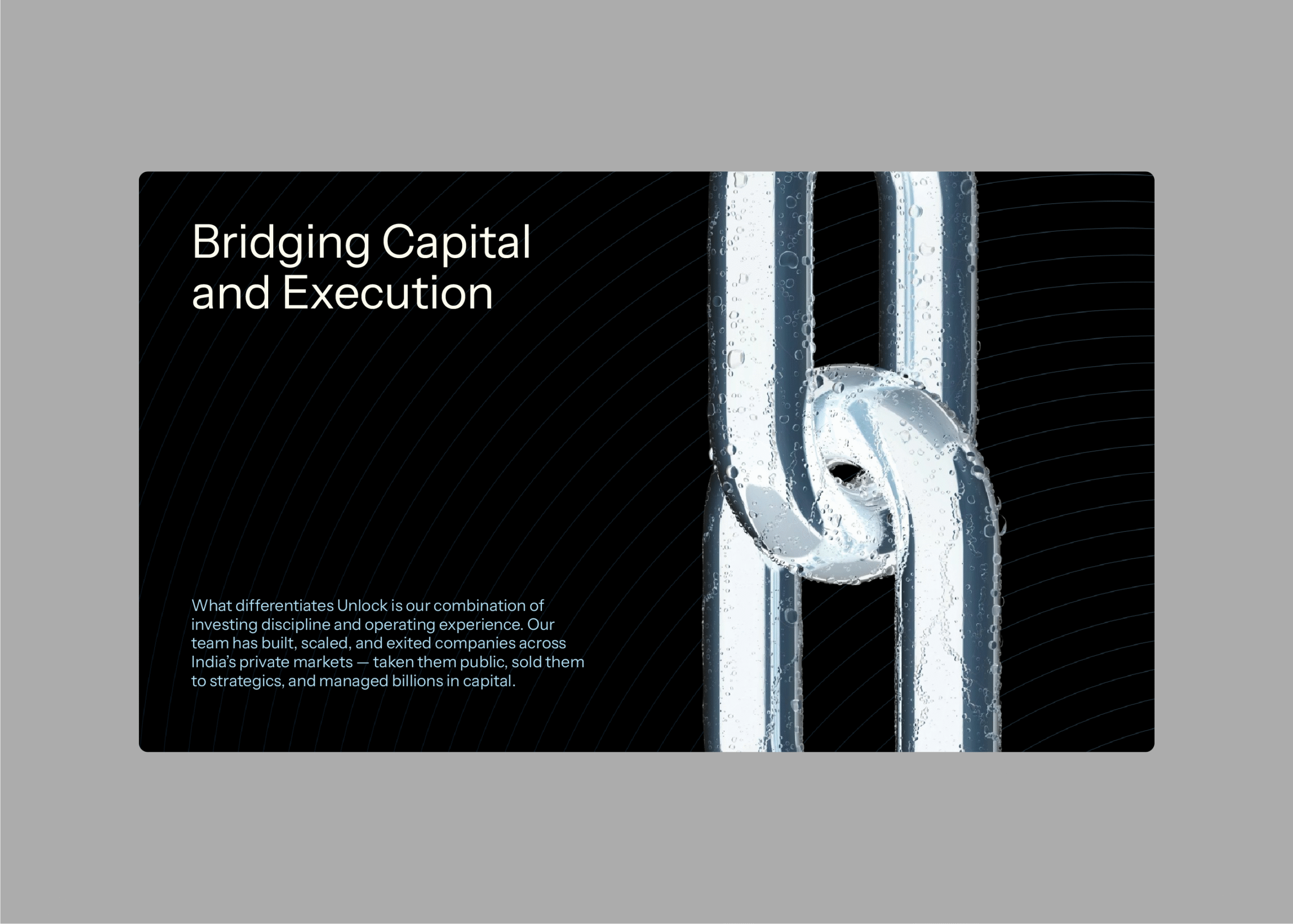
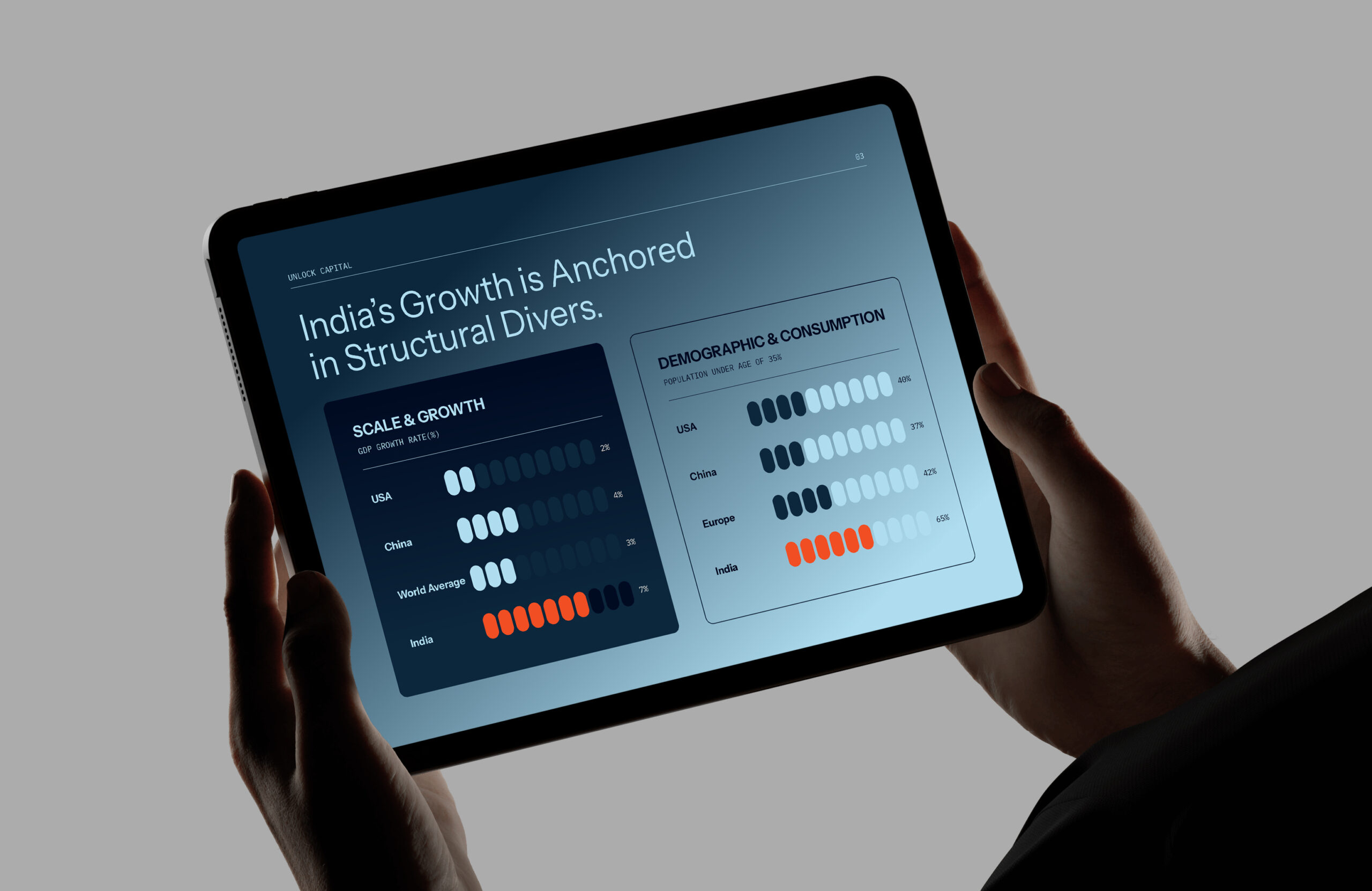
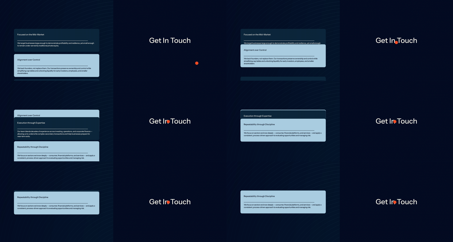
For the colours, we wanted to retain some familiarity within the industry and made our own version of the ‘corporate blue’. This deep teal conveyed a velvety, smooth feel in contrast to our accent of electric orange. Together forming a striking pairing. From here, we created dynamic gradient patterns and presentation templates to complement the logo. Lastly, we used all these established elements to form their simple, function-forward website.

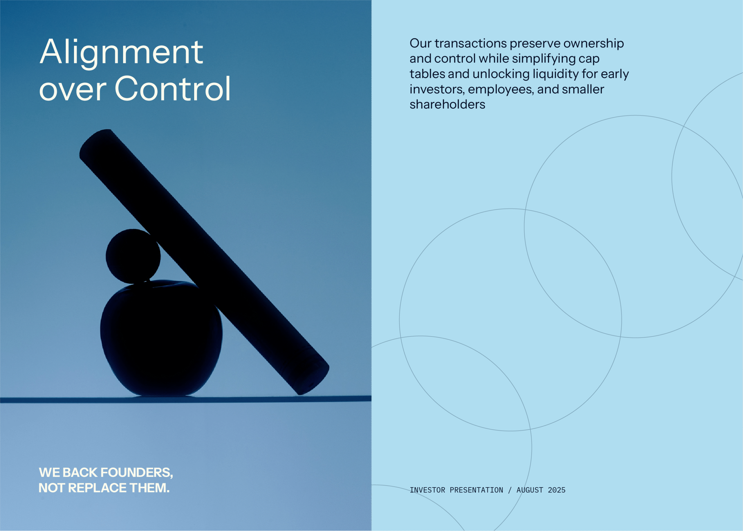
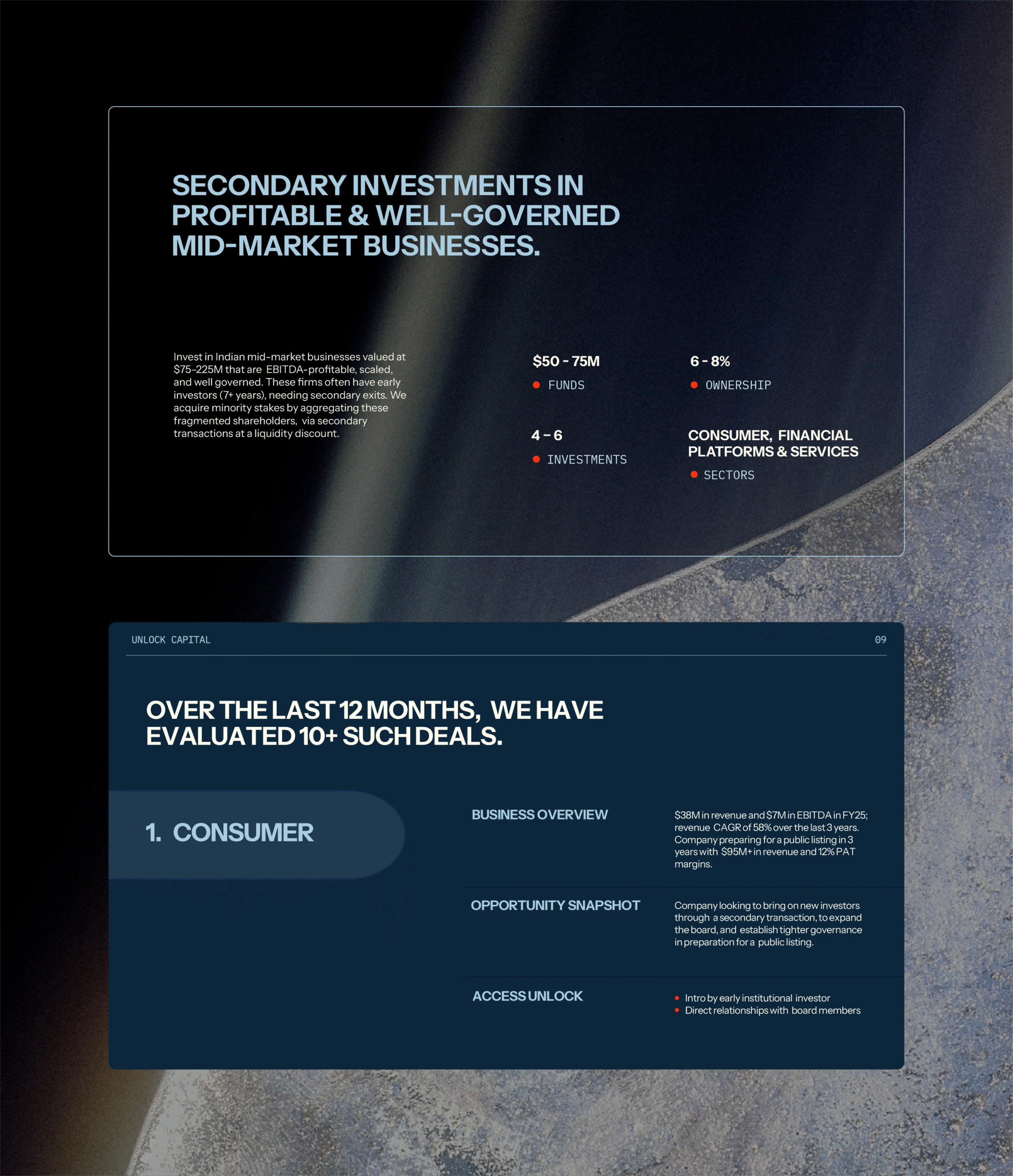
The key to Unlock Capital was in understanding the duality of being a niche category company with an approachable personality — keeping things reliable, but with a breath of fresh air.
